
David Hockney, A Bigger Splash 1967. Tate. © David Hockney.
19 rooms in Walk Through British Art
Migration from former British colonies and new opportunities for artists from different social backgrounds enable a bold and daring visual culture in Britain. Simultaneously, marginalised social groups struggle for equal rights
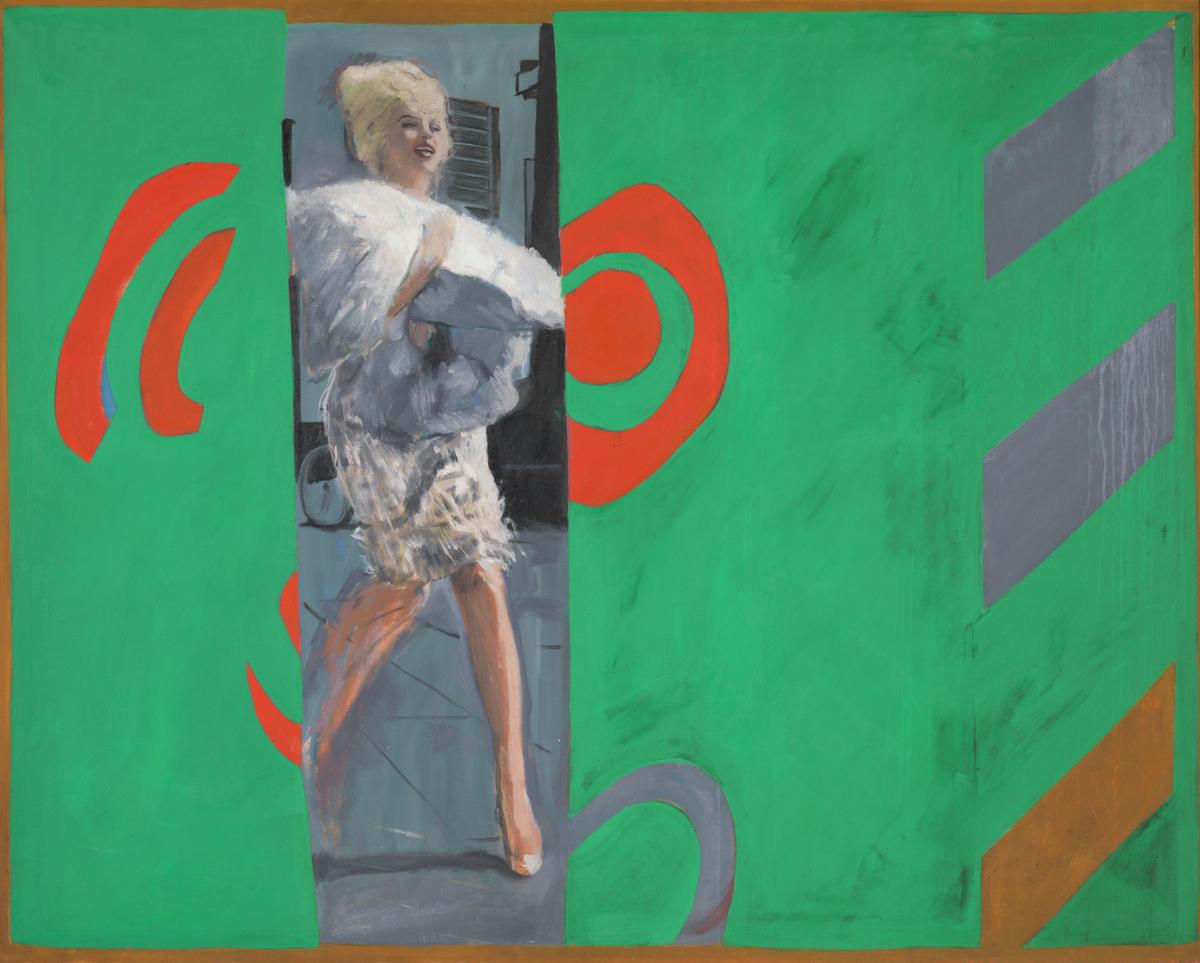
Pauline Boty, The Only Blonde in the World 1963
Pop artists were fascinated by Marilyn Monroe as the most famous of movie stars and the epitome of a new sexuality. Most responses to her were made by men, however. Boty was one of the few women artists working in this vein and perhaps that gave her a different view on Marilyn.Is the figure isolated by being squeezed between fields of abstract forms? Is the title ironic? Boty’s work was sometimes concerned with gender and sexuality and so it is ironic, that she was herself frequently discussed in terms of her appearance.
Gallery label, May 2007
1/12
artworks in 1960–1970
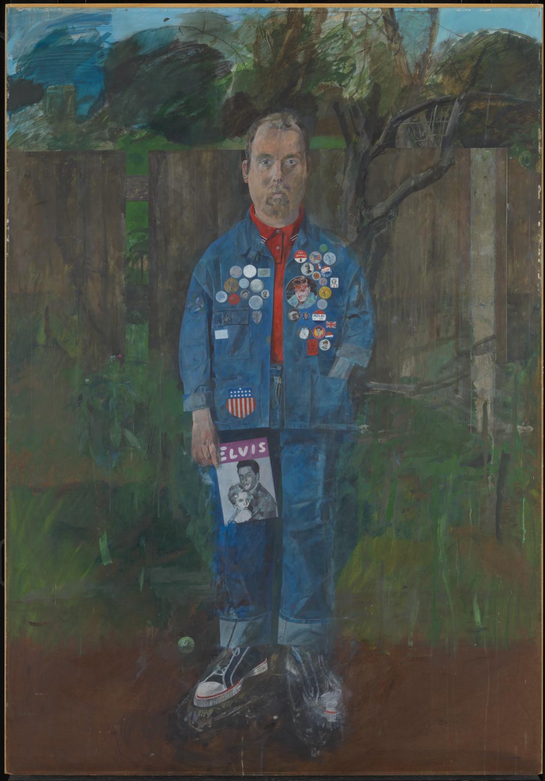
Peter Blake, Self-Portrait with Badges 1961
At the core of Blake’s work is his fascination and engagement with the world of popular culture and entertainment, including music, film and sport. This self-portrait shows his interest in America with objects such as the denim jacket (rare in Britain at the time), baseball boots, badges, and the magazine dedicated to Elvis Presley, who had just become well-known in Britain. Blake uses these items like a 17th-century portrait painter, to suggest his interests or achievements.
Gallery label, October 2019
2/12
artworks in 1960–1970
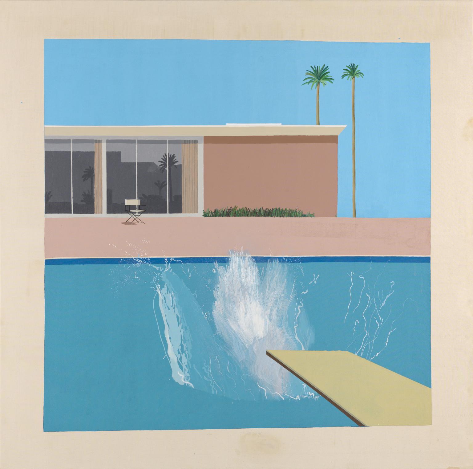
David Hockney, A Bigger Splash 1967
A Bigger Splash is one of a number of paintings Hockney made of Californian swimming pools. He has captured the moment just after someone has dived in. The splash is the only clue to their presence in the scene. Hockney was interested in using paint to capture transparent materials such as water, and fleeting moments, like the splash. The 1960s are often seen as the time that Britain emerged from the difficulties of the post-war years into a period of optimism. This colourful work seems to reflect this feeling.
Gallery label, July 2020
3/12
artworks in 1960–1970
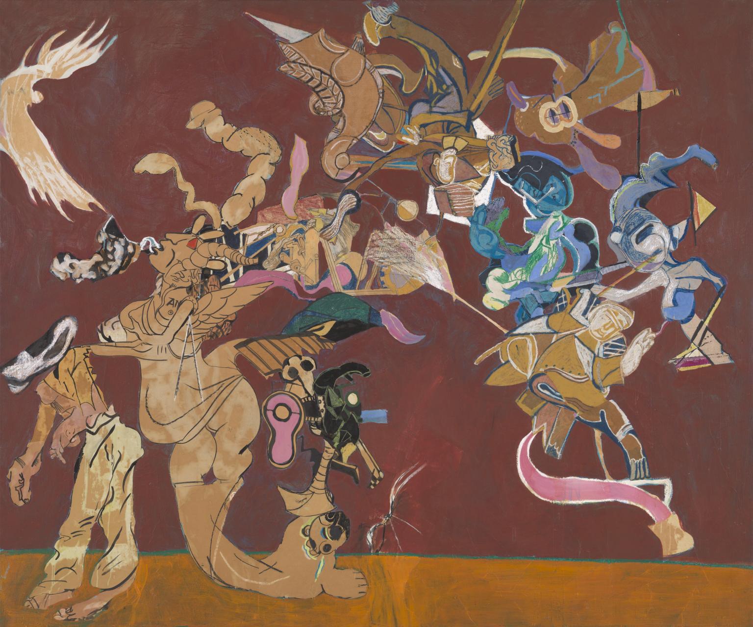
Paula Rego, The Firemen of Alijo 1966
This is a large painting depicting a group of surreal, brightly-coloured figures against a rich red and orange background. The figures are a mixture of human and animal forms combined with convoluted intestinal imagery and abstracted machine-like shapes reminiscent of the forms Marcel Duchamp (1887-1968) painted in his Brides and Nudes series of paintings in 1912. The title of Rego's painting is derived from a group of firemen she saw in Alijo, a small town in northern Portugal, while on holiday there over Christmas and new year 1965-6. The winter was the coldest on record; it snowed and the hotel Rego was staying in with her husband, the artist Victor Willing (1928-88), and her parents had no heating. Rego's father was terminally ill with cancer (he died six months later), her husband was in a bad mood the whole time and Rego said she felt 'a sense of the end of the world' (in unpublished conversation with Judith Collins, 2000). Leaving her mother in her room doing her hair, she wandered around the town and was struck by the poverty of its inhabitants. She saw the firemen outside a tavern huddled together because of the cold. They had bare feet and wore traditional Portuguese coats padded with straw. Their faces were black with soot. Rego has described the painting as a homage to their role in Portuguese society as unpaid volunteers. No figure in the painting is a representation of any particular fireman, but rather an expression of her feelings around that time. Rego has said: 'I can only understand ideas in terms of human relationships - I don't understand political abstractions. People as characters are far more real to me.' (Quoted in McEwen p.76.) She uses her personal narrative and experiences to describe feelings around moral, social and political issues. Rego and Willing lived in Portugal between 1957 and 1962. In 1960 during a brief visit to London for the birth of her second child Victoria, Rego saw an exhibition of work by the French painter and father of 'Art Brut', Jean Dubuffet (1901-85), and was immediately inspired. The discovery of Dubuffet's work helped Rego to reconnect with the intuitive spirit of her childhood, giving her the confidence to allow her imagination free reign in large, childlike scribbles. The accompanying release of energy generated by this process resulted in bright colours communicating a vivid, raw energy. Shortly afterwards Rego began a new body of work, completing a painting each day and often incorporating collaged elements. Initially these were taken from magazines, but when she could not find what she wanted she drew and painted the image on paper and then cut it out. The Firemen of Alijo was made using collaged fragments onto which Rego had previously drawn in charcoal and pastel and painted with gouache and inks. On the left of the painting is a bare-footed man with a badger's head. To the right of him a human-type body topped by a profiled head emerges from an animal base derived from a reproduction of a seal. Balancing on the seal's head is a bird-like figure. The area above the ground, from which it is separated by a narrow green horizontal line, is filled with figures the artist sees as fighting angels. To create these Rego looked at books on medieval art since she wanted to reflect the medieval core of the town of Alijo. She has said: 'I get inspiration from things that have nothing to do with painting: caricature, items from newspapers, sights in the street, proverbs, nursery-rhymes, children's games and songs, nightmares, desires, terrors.' (Quoted in McEwen, p.72.) As she once stated, she paints 'to give terror a face' (quoted in McEwen, p.72). Further reading:John McEwen, Paula Rego, London 1997, reproduced (colour) p.81, pl.72Judith Collins, Ruth Rosengarten, Victor Willing, Paula Rego, exhibition catalogue, Tate Gallery Liverpool 1997 Elizabeth Manchester January 2002
4/12
artworks in 1960–1970
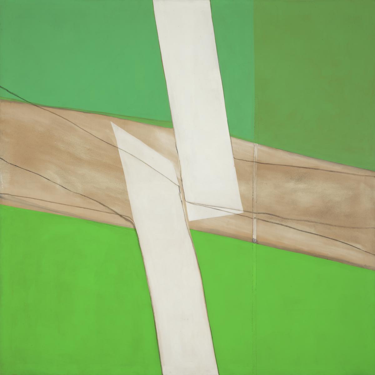
Sandra Blow, Green and White 1969
Blow described herself as an academic abstract painter, blending traditional and improvised materials to create impactful textures, forms and colours. This work incorporates blended ash made from burning nuts in her studio stove. Green and White took Blow one to two months to complete and was made while teaching at the RCA. Previously, she had used low-quality found material, in part as a tribute to her former lover Alberto Burri. In the 1960s, however, Blow made works which were more open, brightly-coloured and apparently celebratory.
Gallery label, September 2016
5/12
artworks in 1960–1970
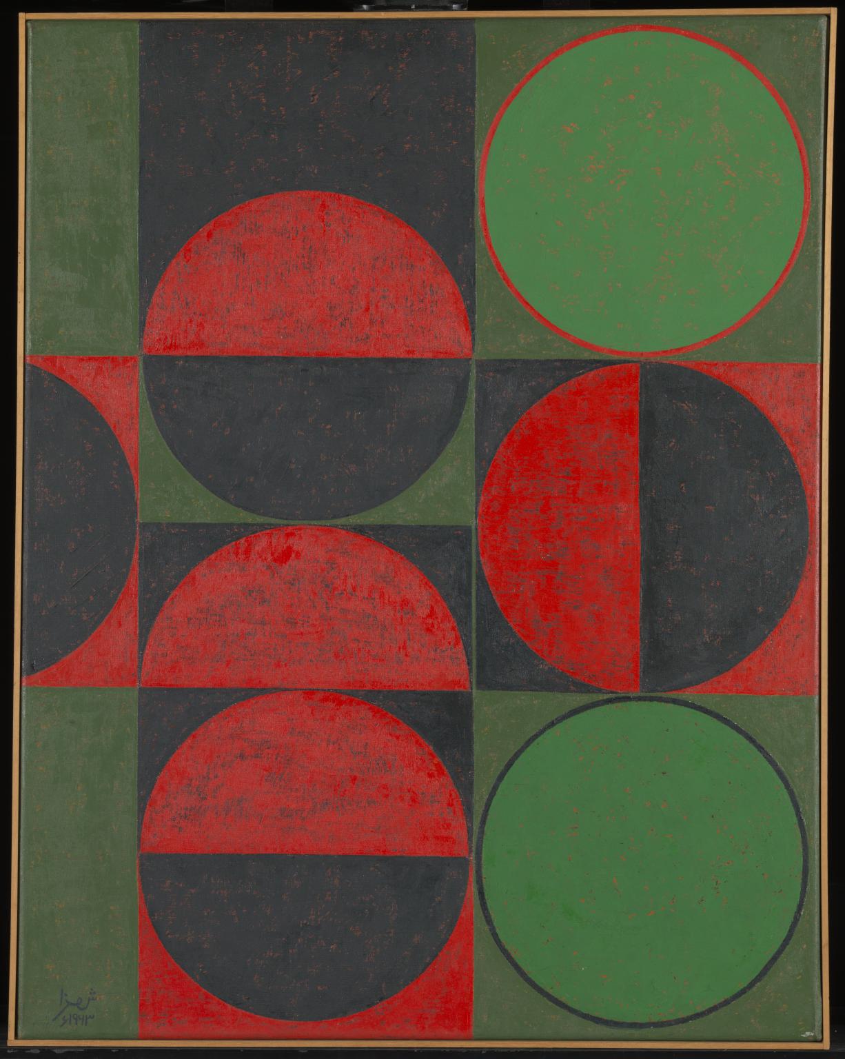
Anwar Jalal Shemza, Composition in Red and Green, Squares and Circles 1963
Shemza began his artistic career in Lahore, Pakistan, as a painter and writer. He moved to London in 1956. Feeling displaced in Britain, he stopped making figurative paintings. Instead he began studying Islamic art from different periods, in search of what he called his ‘own identity’. He started creating compositions that fused calligraphy and aspects of Mughal architecture with European abstract art. He commented: ‘I am much more aware of my own art heritage now than I ever was in Pakistan. You only become aware of the things you lose.’
Gallery label, January 2019
6/12
artworks in 1960–1970
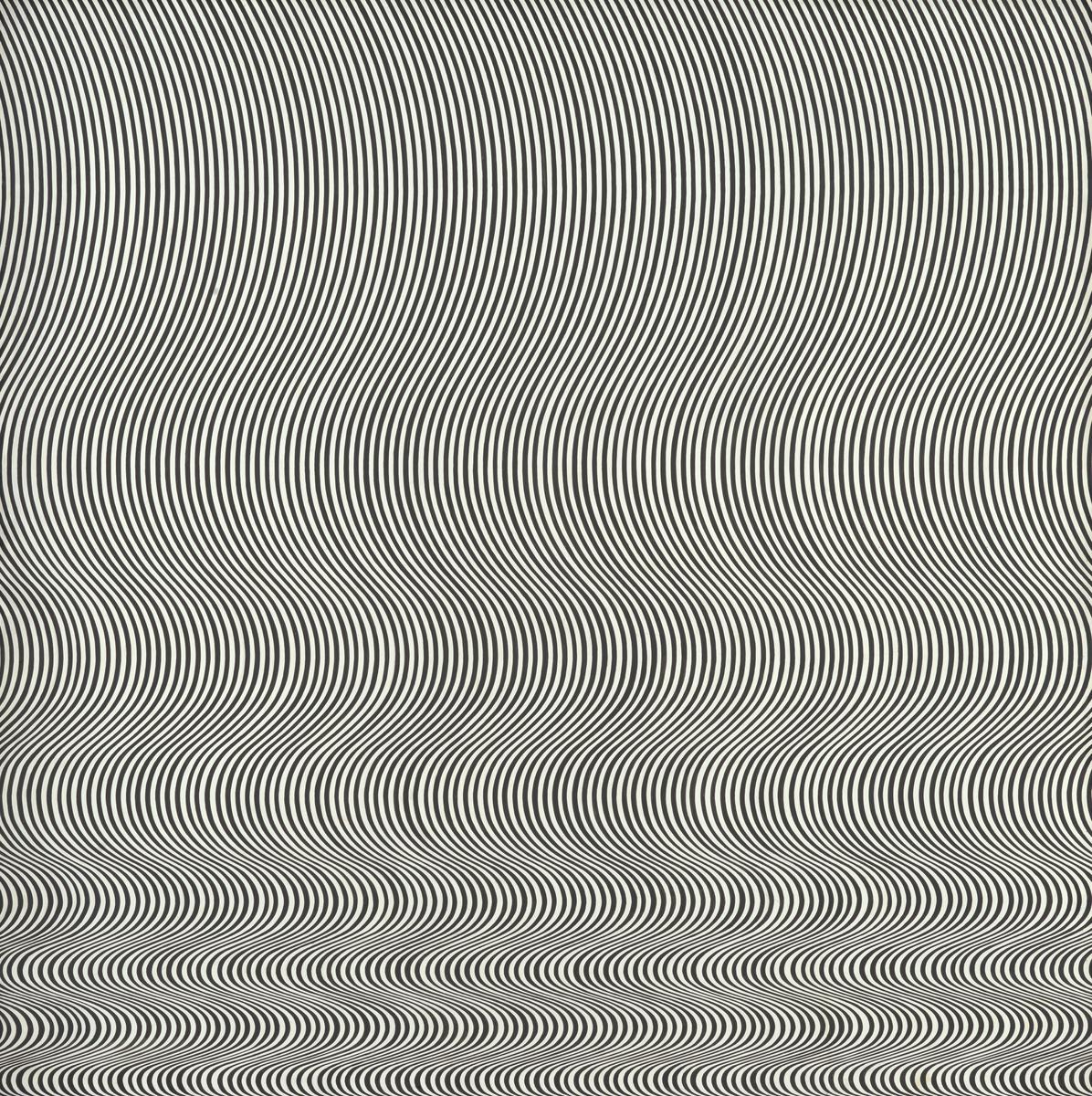
Bridget Riley, Fall 1963
‘I try to organise a field of visual energy which accumulates until it reaches maximum tension’, Riley said of this work. From 1961 to 1964 she worked with the contrast of black and white, occasionally introducing tonal scales of grey. In Fall, a single perpendicular curve is repeated to create a field of varying optical frequencies. Though in the upper part a gentle relaxed swing prevails, the curve is rapidly compressed towards the bottom of the painting. The composition verges on the edge of disintegration without the structure ever breaking.
Gallery label, March 2010
7/12
artworks in 1960–1970
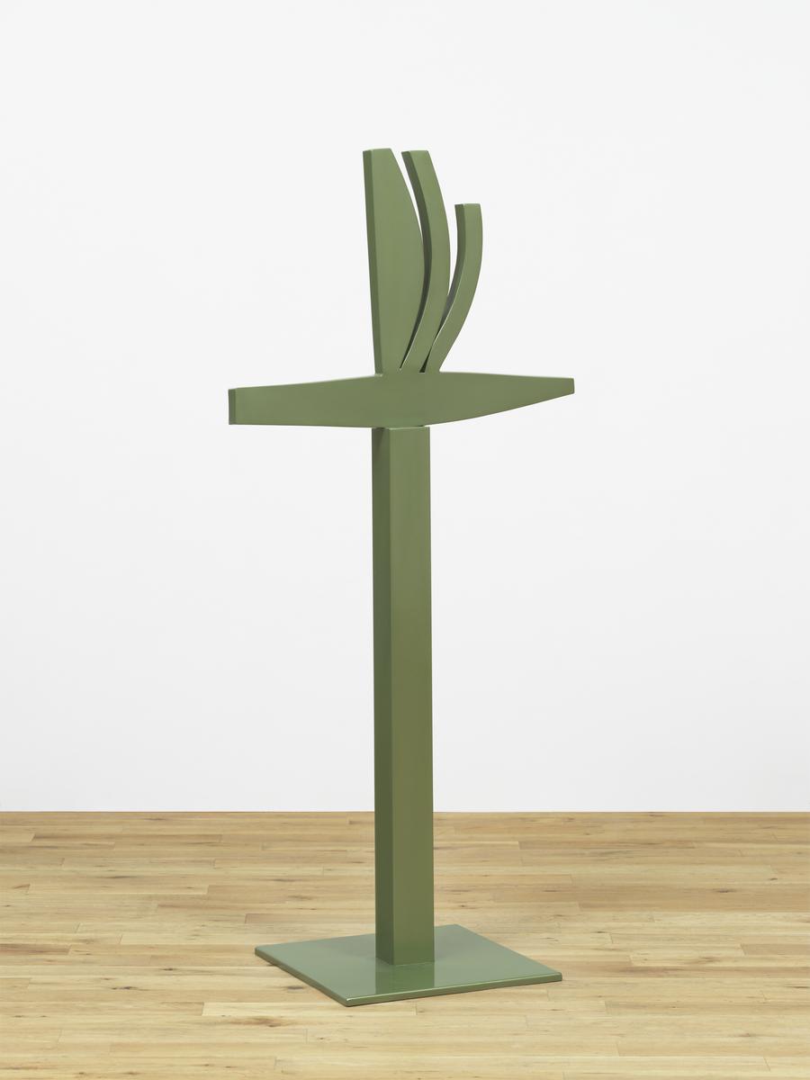
Kim Lim, Borneo 2 (Steel) 1964
8/12
artworks in 1960–1970
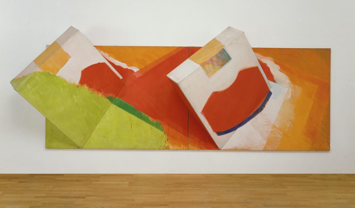
Richard Smith, Gift Wrap 1963
1963 was a year of great innovation for Smith that culminated in his show at the Kasmin Gallery, London. Drawing on both painterly American abstraction and Pop Art, he continued to make large, billboard-like paintings which had a popular, everyday subject and explored the impact of advertising and the media. However, he also began to experiment with the conventions of painting, challenging both its rectangular format and its flatness. In a work such as Vista (Tate T00855), a shaped extension was added to the two-dimensional canvas. In Giftwrap and Piano (Tate T002003) the extensions became three-dimensional. In an interview of 1966 he stated: 'in Fleetwood, as in Pagoda or Vista, for instance, with these rectangular-canvas-plus-extensions, I felt that there could be another kind of … amplification: three-dimensional, which would then enter the real world [and] come out into the spectators space.'(Quoted in Robertson p.12.) At this time Smith was fascinated with packaging. In an interview he stated: 'The carton is an incessant theme in present day civilisation … everything comes in boxes.'(Quoted in Robertson p.12.) For Smith the most ubiquitous of boxes was the cigarette pack, and in 1962 he had made a film called Trailer which consisted of close-ups of cigarette packets, repeated and seen from different angles. The imagery of the film was the inspiration for many of the works Smith painted in 1963. In the majority an originally small packet is blown up to monumental proportions. Giftwrap is over five metres long and suggests the scale of an advertising hoarding. The title and image are a direct reference to the now discontinued Philip Morris cigarette pack, which incorporated a red oval motif with a segment cut out of it. In an unpublished Tate interview, Smith recalled that it was the only American cigarette pack readily available in British tobacconists and it was the brand that he himself smoked at the time. It thus expresses some of his deep pre-occupation with America and American things (in 1964 he was to emigrate to the United States). In Giftwrap, two three-dimensional boxes burst out of the two-dimensional surface. Painted to resemble cigarette packs, the canvas box constructions rupture painting's conventional flatness, breaking into the real space of the gallery. Giftwrap, like Piano, was made in Smith's Bath Street studio in London. First making small maquettes out of cardboard boxes from Windsor and Newton oil colours, he then preceded directly to the construction stage without producing drawings. Each work was made of two parts bolted together and then painted in bright artificial colours. Considering the sculptural quality of the works, Smith stated: 'There is something unnerving about a bulky thing that is suspended on the wall: it can fall. A bulky thing that is on the floor is something that's in the way … It was like having a sofa over the mantle piece'(Quoted in Smith p.2). However, despite the fact that Smith spoke of Giftwrap and Piano in apparently sculptural terms, he emphasised their importance as paintings: 'Since I have always retained a wall, there is no question of a multifaceted sculptural object.'(Quoted in Robertson p.13.) Smith was never to go as far as producing completely free standing sculptures, but rather explored the ambiguous area between painting and sculpture, the real and the illusory, thus challenging the conventions of painting. Further Reading:David Mellor, The Sixties Art Scene in London, exhibition catalogue, Barbican Art Gallery, London 1993, pp.124-128, reproduced (colour) p.128Marco Livingstone, Pop Art: A Continuing History, London 1990, pp.109-111, reproduced (colour) p.100Bryan Robertson, Richard Smith Paintings 1958-1966, exhibition catalogue, Whitechapel Art Gallery, London 1966Richard Smith, Richard Smith, exhibition catalogue, British Pavilion, Venice Biennale, British Council, London 1966 Imogen Cornwall-Jones October 2001
9/12
artworks in 1960–1970
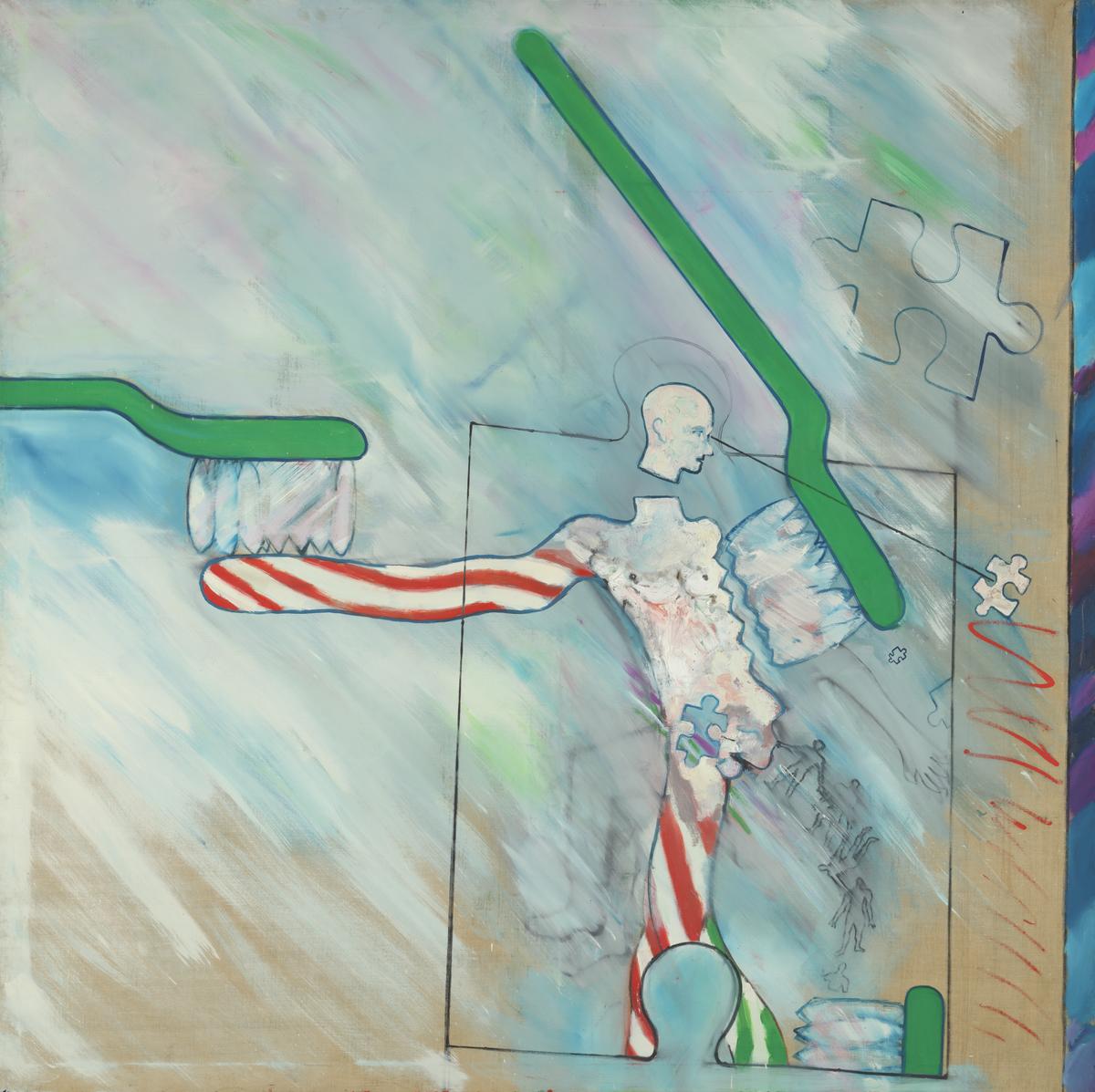
Derek Boshier, The Identi-Kit Man 1962
Boshier was interested in the culture of commodities and the apparent Americanisation of British culture. Toothpaste, which was the first product advertised on British television, is used here to represent both. The Identi-Kit Man presents the image of a man as a jigsaw piece, manipulated into a particular behaviour. As he becomes toothpaste, he is both transforming into, and being shaped by, mass consumer products. In 1962 Boshier wrote: ‘The figure features in my painting as a symbol of “self- identification”. It represents me (us), the spectator, participant, player, or cog in the wheel—the amorphous “us”’.
Gallery label, October 2019
11/12
artworks in 1960–1970
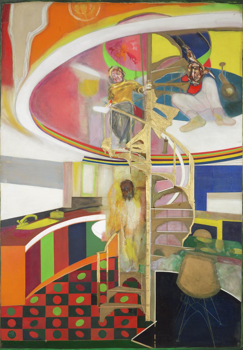
Sir Frank Bowling OBE RA, Mirror 1964–6
Bowling is a contemporary of Hockney and his early work was influenced by Bacon. This painting is about aspiration and inclusion. The staircase is one at the Royal College of Art and the rest of the scene combines contemporary interior design with fashionable art such as that of the op artist Victor Vasarely. Bowling appears twice, once poised at the top, and again arriving at the bottom of the stairs, a conflicted figure caught between two worlds. Despite early success, Bowling had reason to feel excluded and this work can be seen as an expression of the resulting frustration.
Gallery label, September 2016
12/12
artworks in 1960–1970
Art in this room
You've viewed 6/12 artworks
You've viewed 12/12 artworks