
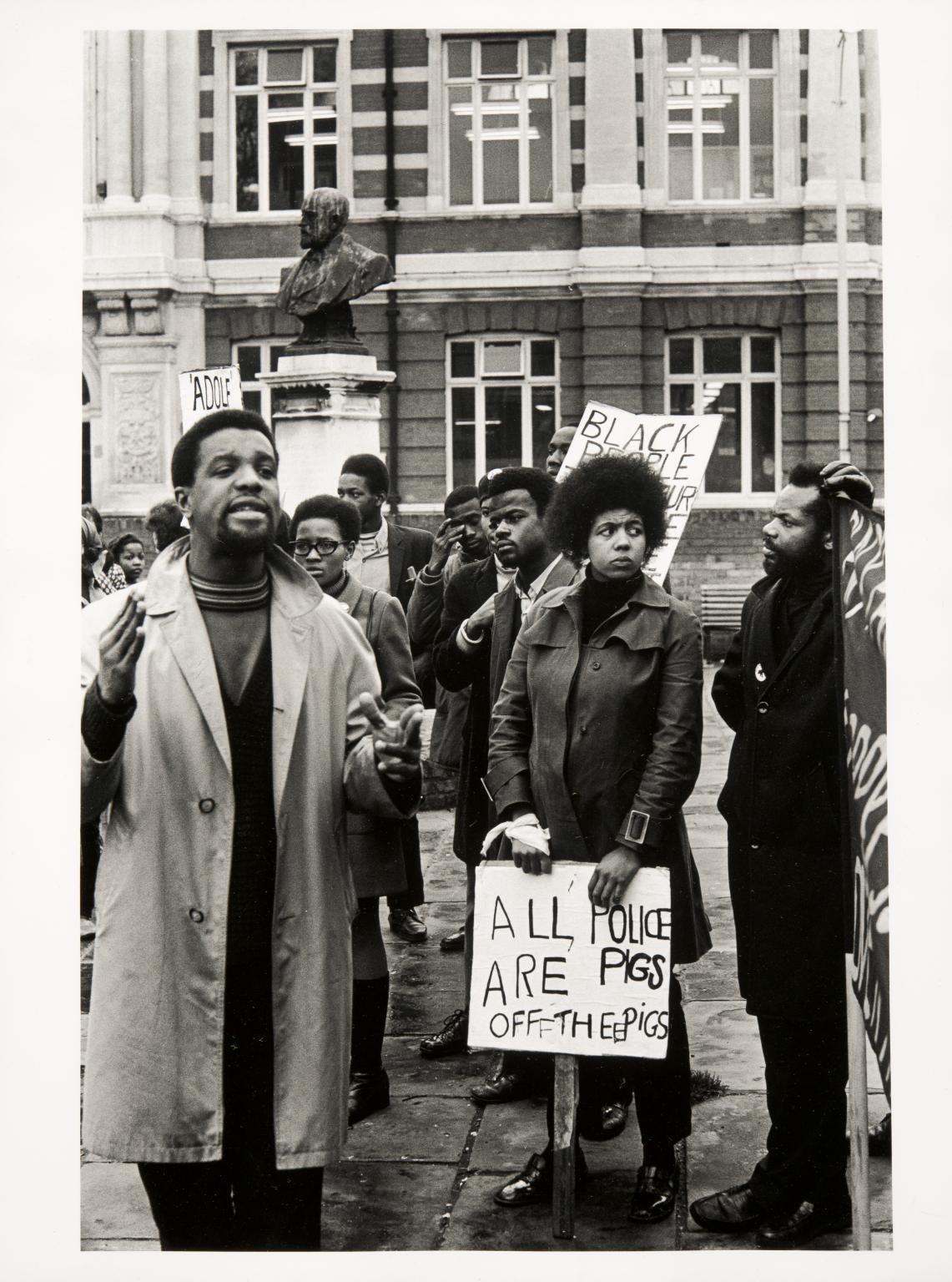
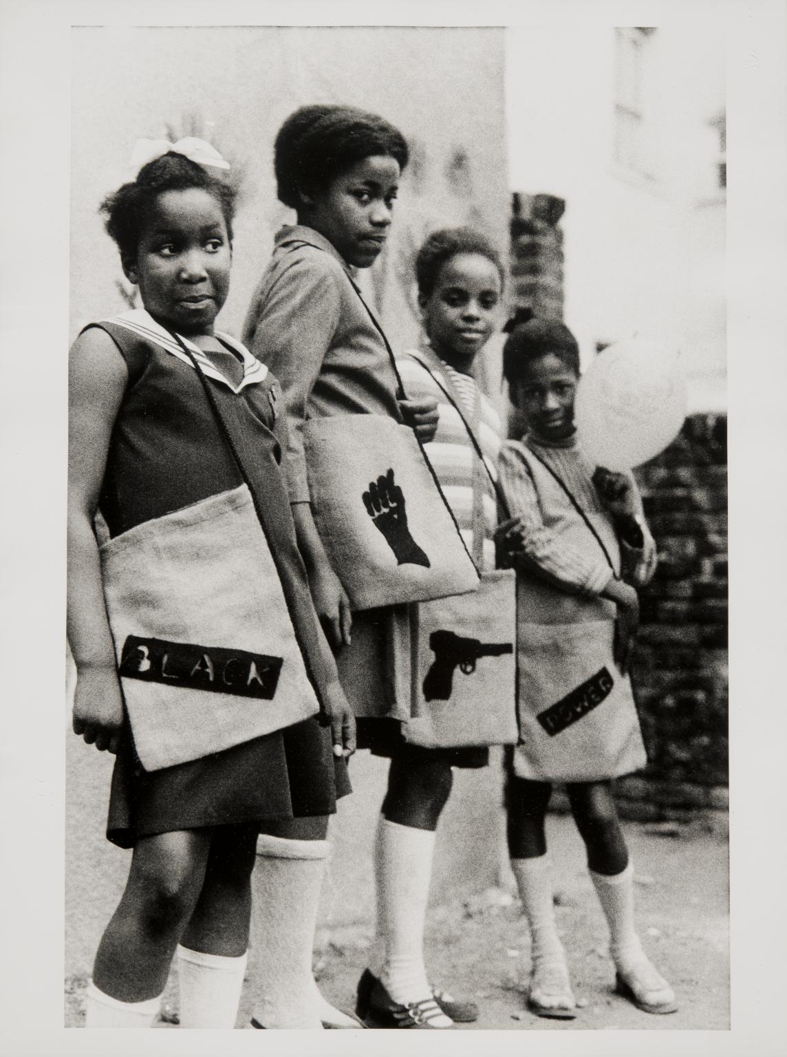
Neil Kenlock MBE, Black Panther school bags 1970, printed 2010. Tate. © reserved.
19 rooms in Walk Through British Art
In an increasingly interdependent and interconnected world, artists begin working with ideas and images that can be rapidly transmitted and address social unrest in their work.

Cecilia Vicuña, Precarios: A Journal of Objects for the Chilean Resistance 1973–4
1/23
artworks in 1965–1980
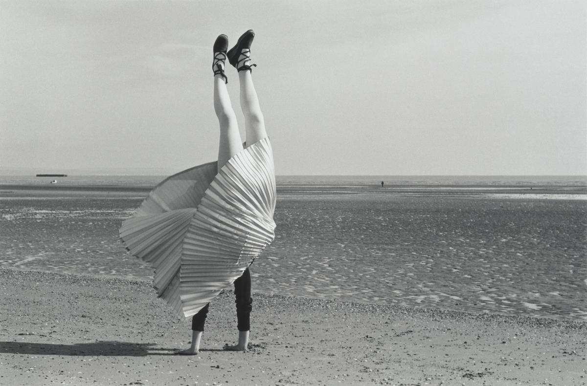
Rose Finn-Kelcey, The Restless Image: a discrepancy between the seen position and the felt position 1975
In the mid-1970s, Finn-Kelcey started staging performances. This photograph was inspired by a snapshot of the artist’s mother. Finn-Kelcey revisited a beach near Dungeness, Kent, where her family had gone when she was a child, and took a series of photographs of herself performing handstands. The image appears to capture an exuberant, impulsive gesture but the work’s subtitle suggests a divergence between the experience of the subject and what is visible to the spectator. The artist continued to explore the inconsistency between internal experience and external observation in the 1970s.
Gallery label, October 2013
2/23
artworks in 1965–1980

Gavin Jantjes, A South African Colouring Book 1974–5
Jantjes was born in Cape Town, South Africa, and studied fine art at the University of Cape Town (1966-9). He left South Africa in 1970 after being awarded a DAAD scholarship to study at the Staatliche Hochschule für bildende Künste in Hamburg, Germany (1970-2). A South African Colouring Book was produced in Hamburg in 1974 and 75. It is a series of eleven poster-type prints made up of image and text presented in the guise of a child’s colouring book. Each page is screenprinted from a collage, based on a gridded background, comprising photographs, newsprint, drawings and sections of printed, stencilled and handwritten text. A drawing book logo is stamped on the black portfolio cover and on many of the prints. Similarly a row of six blocks of colour may emphasise the ‘colouring’ activity. Additional sections of text are attached by paper clip to several prints. The titles all refer to colour – the concept central to race discrimination in South Africa which is the principal subject of this work. Jantjes used a combination of personal material – such as his own identity pass card, defining him as a ‘Cape Coloured’ (see Tate P78648) – with material culled from the external world including financial market reports in the newspapers (Tate P78653), cultural texts (Tate P78649) and photographs by the black South African photojournalist Ernest Cole (1940-90) who documented the sufferings of black South Africans during the 1960s (Tate P78649-52). Images of black miners, massacred innocents and exploited workers combine with excerpts quoting the words of B.J. Vorster (1915-83), South African Prime Minister (1966-78) and upholder of the apartheid regime (Tate P78647, P78650 and P78654).
3/23
artworks in 1965–1980
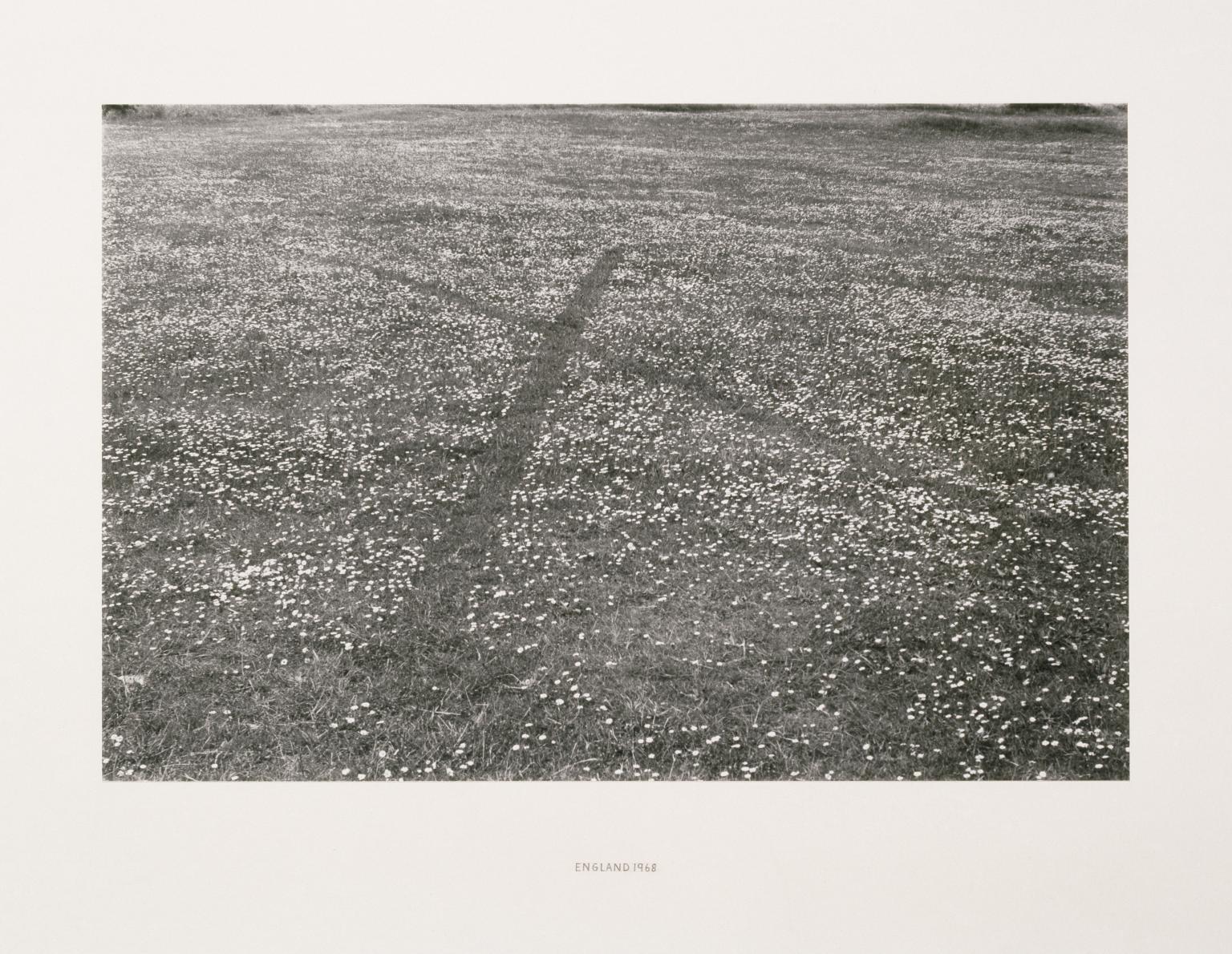
Richard Long CBE, England 1968 1968
In a field of daisies, Long picked flowers along two lines to form an 'X'. The work existed only until the daisies grew again. He made a more permanent record in the form of this photograph. Long''s art develops through a physical involvement with landscape. During a walk, for instance, he may subtly rearrange natural elements at a particular spot as a way of marking his presence. 'These works are of the place, they are a rearrangement of it and in time will be reabsorbed by it. I hope to make work for the land, not against it', he says.
Gallery label, August 2004
4/23
artworks in 1965–1980
Gilbert & George, In the Bush 1972
5/23
artworks in 1965–1980
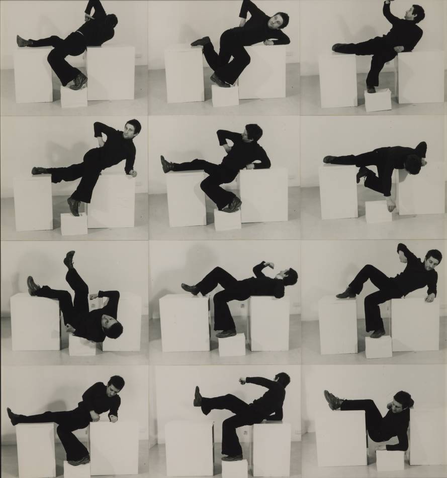
Bruce McLean, Pose Work for Plinths I 1971
This work, one of three Pose Work for Plinths, was originally conceived as a performance at the Situation Gallery in 1971. McLean’s poses are an ironic and humorous commentary on what he considered to be the pompous monumentality of Henry Moore’s large plinth based reclining sculptures. The artist was photographed repeating the poses from his performance. The plinth in McLean’s work also functions as an ironic reference to its dogmatic rejection as a legitimate base for sculpture by Anthony Caro and others teaching at St Martin’s School of Art when McLean was a student there between 1963 and 1966.
Gallery label, September 2016
6/23
artworks in 1965–1980
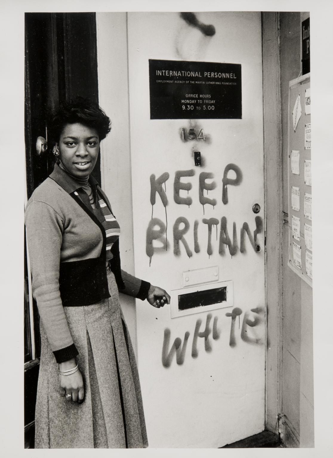
Neil Kenlock MBE, ‘Keep Britain white’ graffiti, Balham 1972, printed 2010
7/23
artworks in 1965–1980
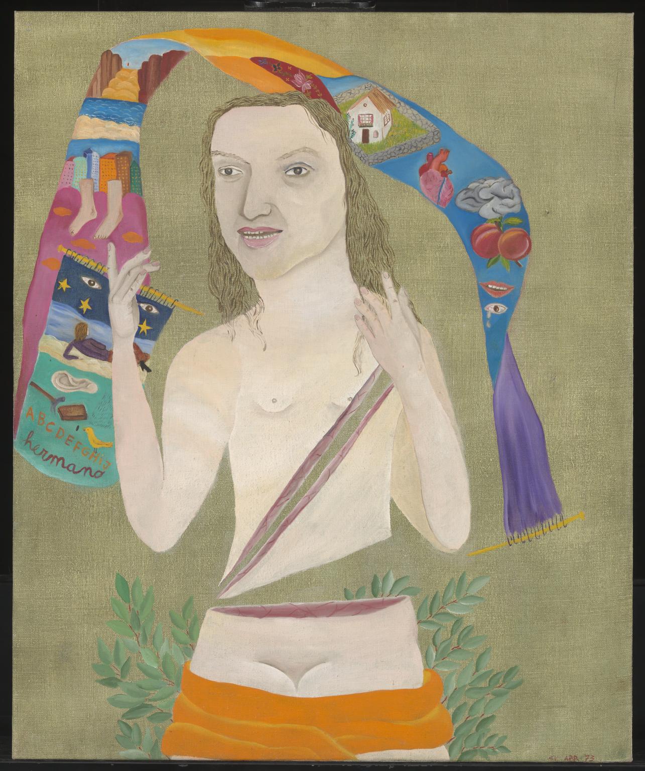
Cecilia Vicuña, Violeta Parra 1973
Violeta Parra 1973 is a half-length figure painting of a naked woman. She is depicted with both her hands raised and an orange shawl wrapped around her lower thighs, behind which is a laurel bush. Her figure is represented as if sliced into three sections – her lower torso is severed from her upper torso and another cut runs diagonally from her left shoulder to her right hip. Her mutilated form is framed by a brightly coloured scarf-like banner which billows like an arch above her head. The painting is part of a series entitled Heroes of the Revolution, which also includes the portraits Karl Marx, Lenin and Fidel y Allende, each from 1972 (all in private collections). Describing this series, Cecilia Vicuña has written: ‘It is very hard to paint and choose them [heroes] because I don’t like the idea of hero. I paint them to laugh. Neither the paintings or heroes are “objects” of laughter but rather we laugh together.’ (In Institute of Contemporary Art 1973, p.6.) Vicuña’s paintings from the early 1970s narrate her own personal biography interwoven with the history of her native Chile and the rise of socialism. ‘My paintings’, she has explained, ‘are political in a personal way. My canvases are born as representations of a socialist paradise where everything is possible; in fact, they are part of my poetry.’ (Quoted in press release for Institute of Contemporary Art 1973, held at Tate Archive, TGA 955/7/8/64.) This approach also underpins her work in other media, such as the installation Precarios: A Journal of Objects for the Chilean Resistance 1973–4 (Tate T14170).
8/23
artworks in 1965–1980
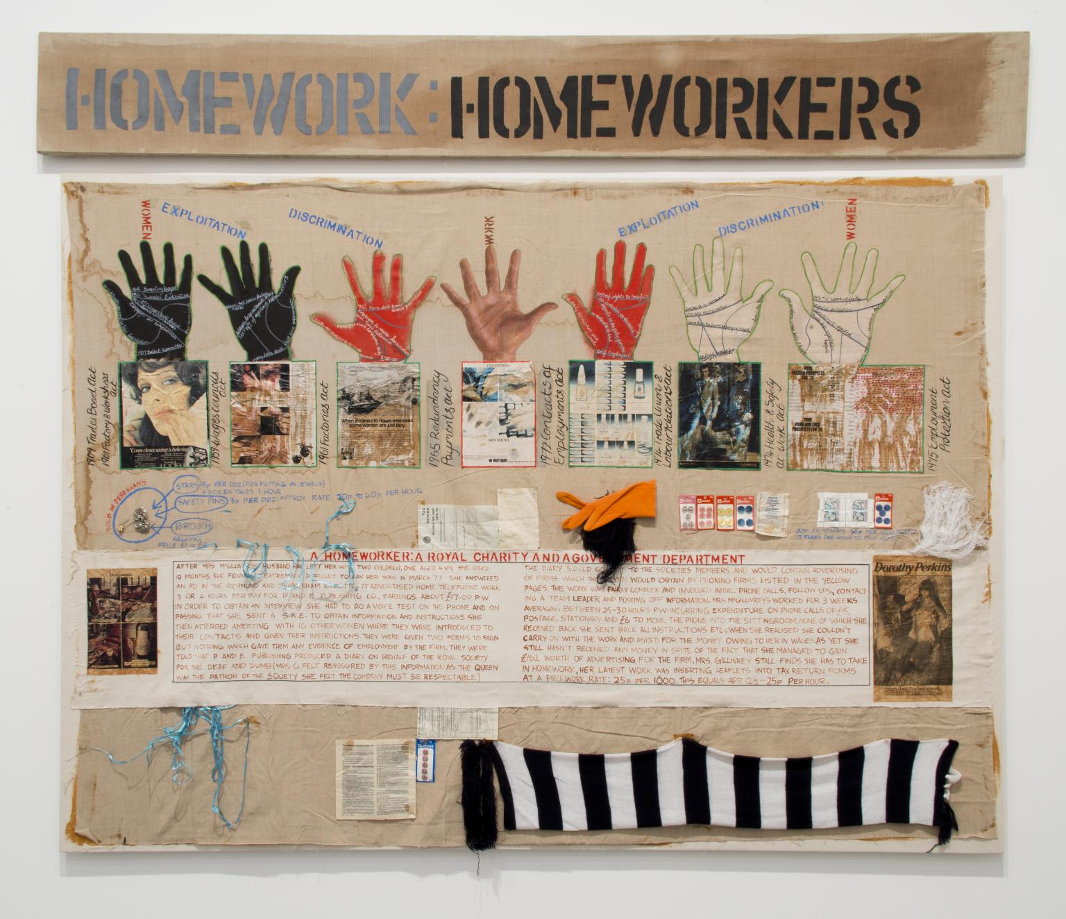
Margaret Harrison, Homeworkers 1977
Harrison advocated action and strong political discourse as the only effective means of fighting for workers’ and women’s rights. She began to research Homeworkers when the Equal Pay Act came into force in the UK in December 1975. Harrison worked with the National Campaign for Homeworkers in London for two years and interviewed several piece workers. The canvas includes items such as gloves, brooches, buttons and safety pins, flanked by their selling price, their production time and the money paid to their makers. The seven hands painted at the top symbolise the manual toil involved in piece work.
Gallery label, August 2013
9/23
artworks in 1965–1980
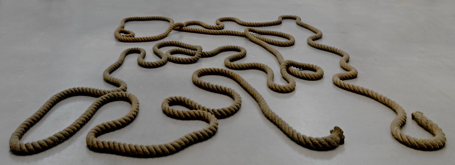
Barry Flanagan, rope (gr 2sp 60) 6 ‘67 1967
Flanagan wanted to show the sculptural properties of everyday things. In the mid-1960s, when he was a student in London, the prevailing tendency was for sculptors to weld together vividly coloured metal structures. By contrast, Flanagan began to explore soft and malleable materials that would change their configuration in every installation. Rope (Gr 2sp 60) 6 '67 is made with industrial rope which he dyed green, section by section, in his bath. Originally the rope crossed from one room to another but it was also exhibited in a single space.
Gallery label, April 2009
11/23
artworks in 1965–1980
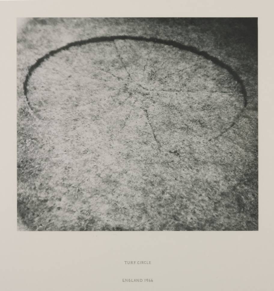
Richard Long CBE, Turf Circle 1966
12/23
artworks in 1965–1980
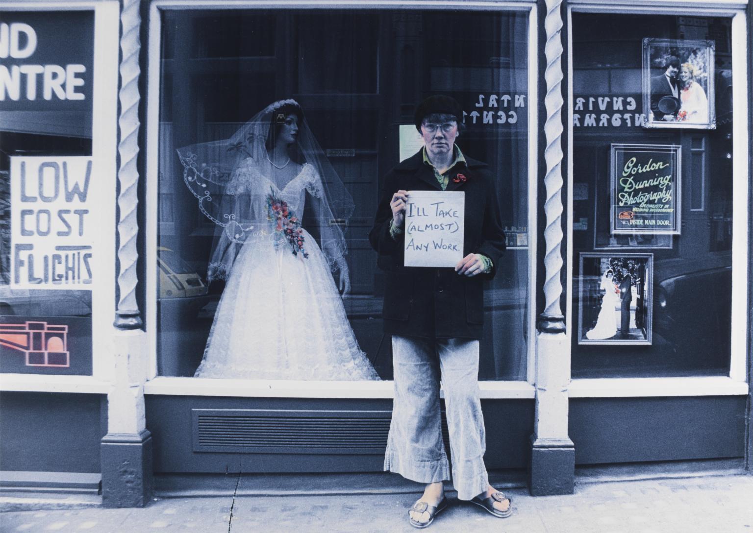
Jo Spence, The Highest Product of Capitalism (after John Heartfield) 1979
This photograph shows Spence standing in front of a shop window holding a sign thatreads ‘I’ll Take (Almost) Any Work’. It makes direct reference to a work from 1932 by Dada artist and photomontage pioneer, John Heartfield. In Heartfield’s work a male figure wearing a sign declaring ‘Any work accepted’ stands in front of an image of a woman wearing an opulent wedding dress. Spence exchanges the male figure for her own figure opening up broader commentary on women’s position in the workplace and more specifically her work as a commercial photographer.
Gallery label, September 2018
13/23
artworks in 1965–1980
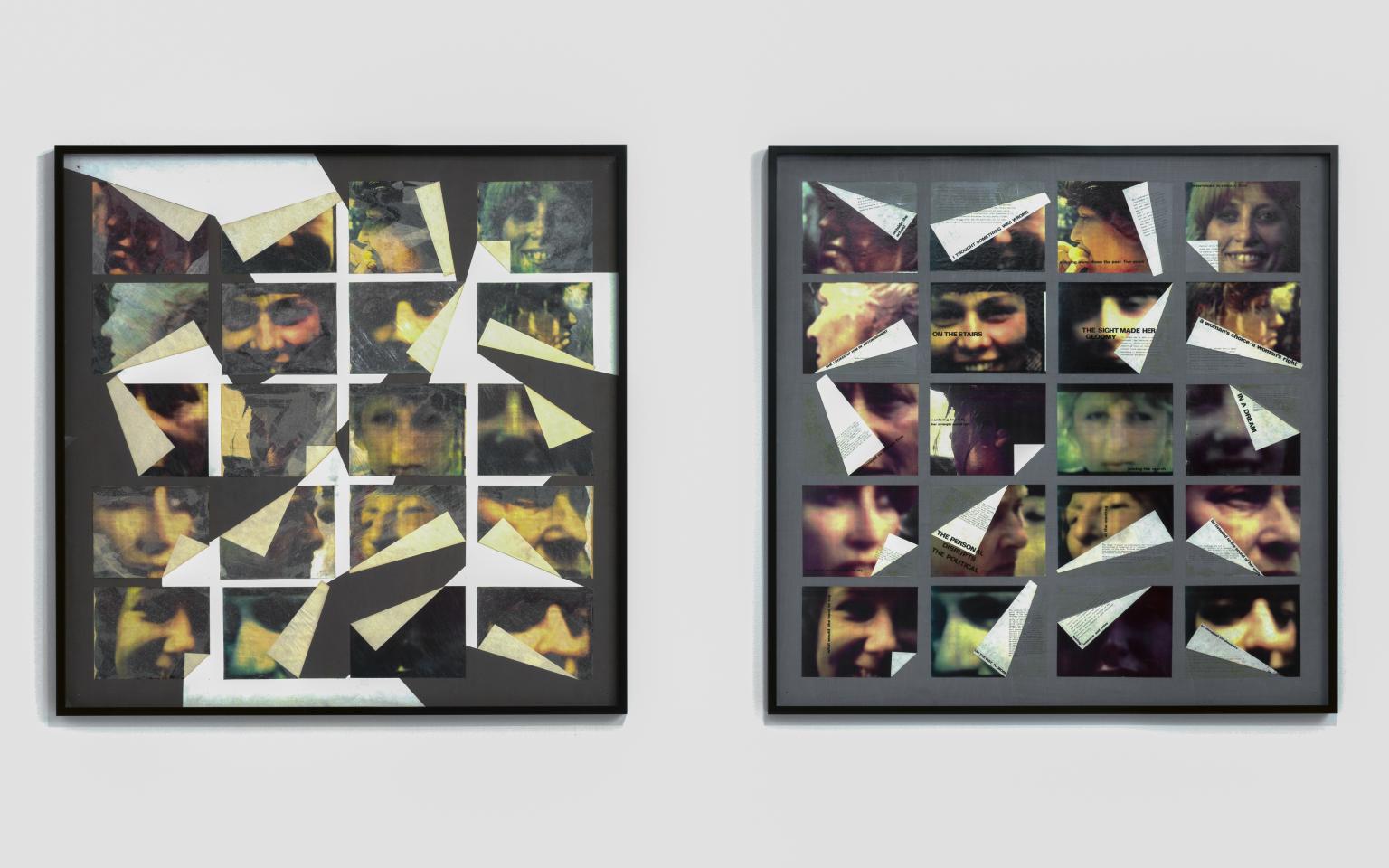
Marie Yates, Image/woman/text 1979
Image/woman/text 1979 is a two-part work that combines paper, photographs and text on two identical, large square wooden boards. The same twenty photographs – out of focus, tightly cropped portraits of different individuals – were printed on gloss paper and used as source material for the two boards. On the left panel the photographs were painted over with acrylic paint and also had tissue paper glued to their surface, reducing their legibility to a minimum and enhancing their material treatment and surface quality. On the right panel the same photographs appear with no painted or collaged intervention, preserving the high gloss finish and intense colour reproduction typical of advertisements published in magazines in the 1970s. On both panels sections of the images have been folded over onto themselves, so that part of each image is concealed by the white paper at the back of the image. While on the left panel these folded areas were left blank, on the right panel the equivalent areas, as well as the front of the colour photographs, underwent a further process, text being typewritten and superimposed on their surface, using the transferable lettering system Letraset. Titles, in larger font, head up different sections of text. The short texts address issues relating to the representation of women and the consumption of their images, making explicit the questions that led to the making of the work and the issues it raises. One of a number of texts foregrounding the role of both the artist/author and of the viewers/readers in their appraisal of the images reads: ‘It is an exercise of power and subjectivisation to which the reader has no exit. In particular if the absent entity is recognised to be a woman, then particular and definite fixed meanings are constructed, and as a woman who is speaking, I have crucial interest in that which is spoken of, constructed by the work.’
14/23
artworks in 1965–1980
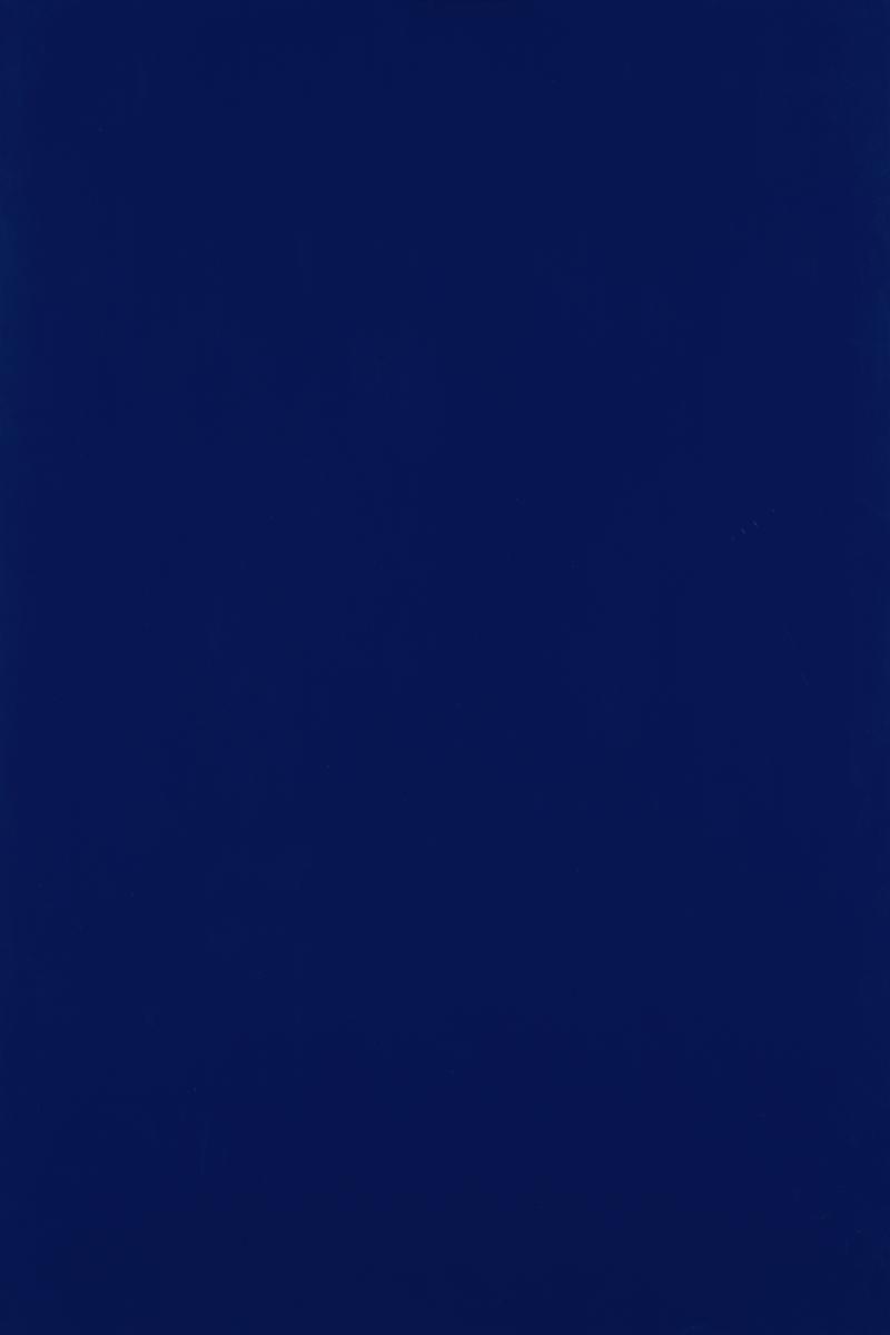
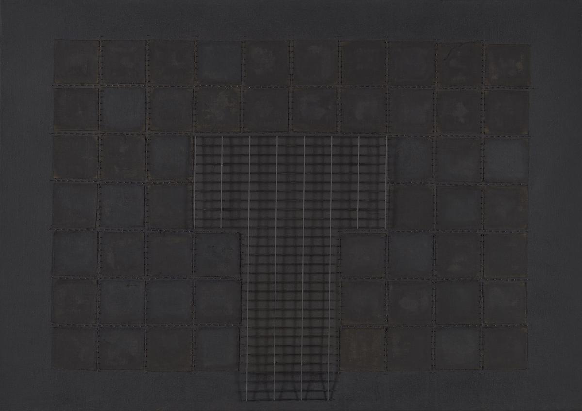
Ian Burn, Blue Reflex 1966
Blue Reflex 1966 is a portrait format monochrome blue painting on board. It followed a group of similarly blue monochrome paintings that had been painted using acrylic paint and a layering of glazes on stretched canvas. Burn wished to create a surface that would not be broken up either by the weave of the canvas or the irregularity of manually applied paint, and with the group of paintings that followed, of which Blue Reflex is one, he prepared ply-board with an epoxy resin before applying automobile lacquer with an airgun. The result was a painting that erased many traces of artistic gesture and achieved a uniformity of finish, but the use of automobile lacquer introduced a quality of reflection not apparent in his previous paintings that relied wholly on glaze for such effects. The choice to apply lacquer with an airgun gives the painting a character close to a manufactured object. Yet, although the quality of reflection draws attention away from the painting and towards its surface and what is reflected within it, the edges of the painting reveal its handmade materiality.
15/23
artworks in 1965–1980
Donald Locke, Dageraad From the Air 1978–9
This work is titled after the Guyana sugar plantation Dageraad. In 1763 it was the site of Guyana’s first rebellion of enslaved people. Locke addressed the themes of plantations in works from 1972–9 and he considered them some of his most important. They function as visual metaphors for the corrosive plantation system of labour that shaped the history of the artist’s native Guyana under Dutch and later British colonial rule. The abstract minimalism of this painting reflects the brutal uniformity of colonial rule and slavery, which reduced people and land to expendable commodities.
Gallery label, January 2022
16/23
artworks in 1965–1980
Neil Kenlock MBE, Demonstration outside Brixton Library 1972, printed 2010
17/23
artworks in 1965–1980
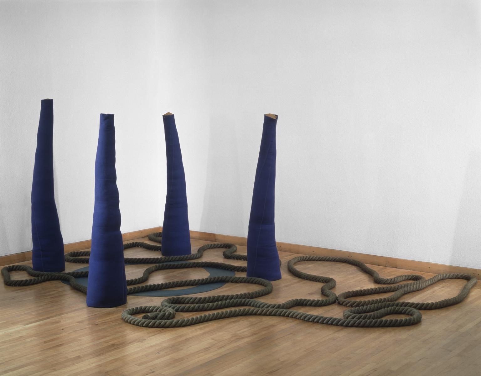
Barry Flanagan, 4 casb 2 ‘67 1967
'Four, Casb 2'67', 'Ringl 1'67' and 'Rope (Gr 2Sp 60) 6'67' are three separate works by Flanagan. Each title is an abbreviation of a technical description. 'Four Casb 2 '67' 'derives from four canvas sand bags number two 1967', while 'Ringl 1'67' is reduced from Ring lino number one 1967 and 'Rope (Gr 2Sp 60) 6'67' comes from 'Rope green two space sixty feet number six 1967'. This titling system was partly inspired by Flanagan's interest in the writings of Alfred Jarry, and in concrete poetry. Although all works are separate sculptures, when placed together they offer a culmination of Flanagan's work in the late 1960s. Flanagan wrote of them in 1969: 'It is fortuitous or interesting that they negate their specific identities and work together in such a way.'
Gallery label, August 2004
18/23
artworks in 1965–1980
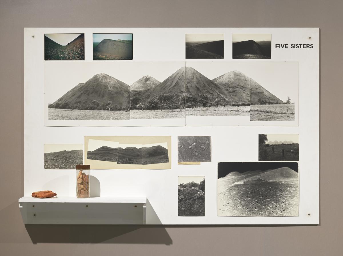
John Latham, Derelict Land Art: Five Sisters 1976
In 1966 Latham founded the Artist Placement Group with Barbara Steveni, Jeffrey Shaw and Barry Flanagan, to set up ‘placements’ for artists within organisations and businesses. The intention was that, by sharing skills, artists would play a more active and influential role in society.
In 1975-76 Latham undertook a placement with the Scottish Development Office. He was invited to come up with a plan for dealing with ‘bings’ or huge heaps of coal waste. Recognising that the bings had an ‘immaculate and classical nature’, Latham recommended they be preserved as monuments, thus eliminating the need for their costly removal.
Gallery label, February 2010
19/23
artworks in 1965–1980
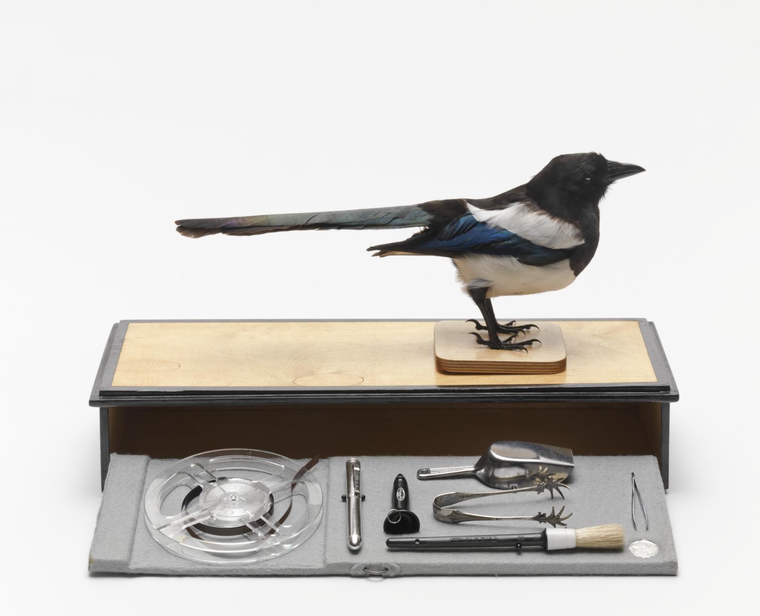
Rose Finn-Kelcey, The Magpie’s Box 1977
This sculpture relates – a two-day performance Finn-Kelcey made with two magpies in the window space of Acme Gallery, London in 1976. Finn-Kelcey spent her time in the space talking to the pair of magpies, offering them food and objects. She commented: ‘I wanted to talk about the potential for another language, apart from the existing one that we tend to feel is the only one…and through that talk about a potential for women having a voice’. This reflected a broader attempt by women in the 1970s to challenge the centrality of an authoritative ‘male voice’.
Gallery label, September 2016
20/23
artworks in 1965–1980
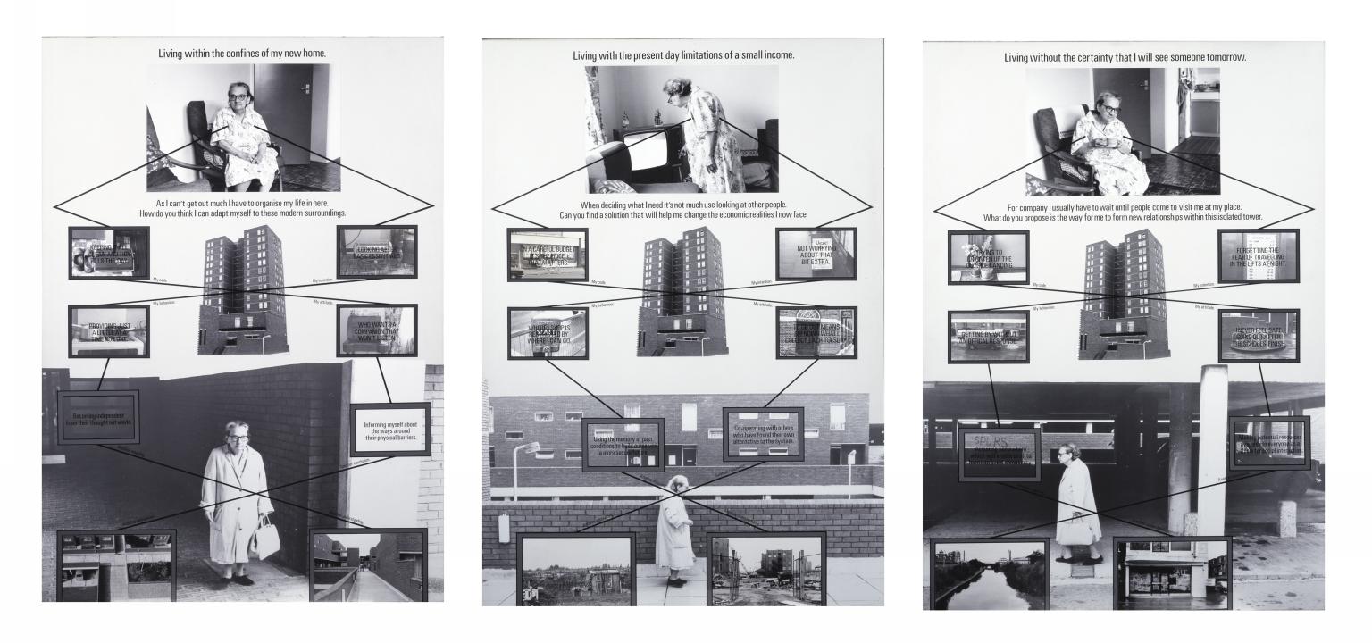
Stephen Willats, Living with Practical Realities 1978
Across three panels, Stephen Willats explores the realities of living in a 1970s British tower block. The work centres on Mrs Moran, an elderly woman who lived at Skeffington Court in Hayes, West London. Willats photographed and interviewed Mrs Moran over the course of six months. The text in the work is based on these interviews. In his composition, Willats highlights the physical, social, and economic constraints that Mrs Moran experienced. Each panel also features a question. These invite the viewer to participate directly in Mrs Moran’s lived experiences.
Gallery label, October 2020
21/23
artworks in 1965–1980
Neil Kenlock MBE, Black Panther school bags 1970, printed 2010
22/23
artworks in 1965–1980
Rasheed Araeen, Fire! 1975, printed 1984
23/23
artworks in 1965–1980
Art in this room
You've viewed 6/23 artworks
You've viewed 23/23 artworks