In Tate Liverpool
- Artist
- Gillian Ayres RA CBE 1930–2018
- Medium
- Acrylic paint and screenprint on paper
- Dimensions
- Image: 922 × 920 mm
- Collection
- Tate
- Acquisition
- Presented by the artist 1996
- Reference
- T07118
Summary
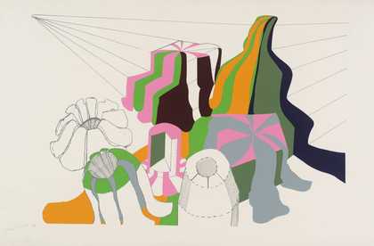
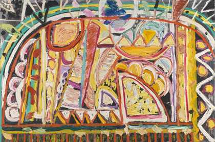
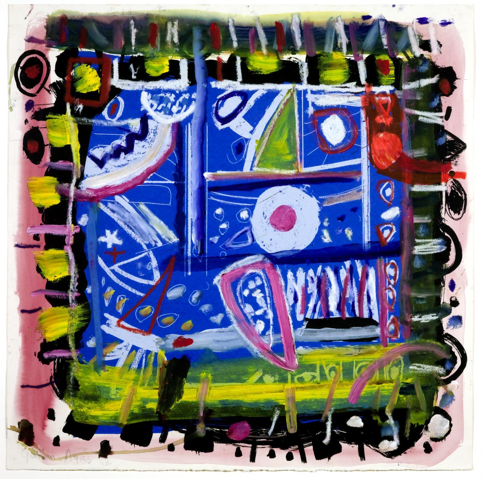
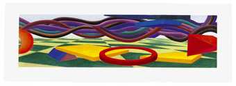
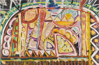
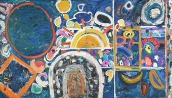
The Colour That Was There is a screenprint overlaid with acrylic paint by the British artist Gillian Ayres. Almost square in shape, the work is dominated by a central blue section containing a number of interlocking forms that are predominantly rendered in white outlines, including circles, rectangles, semicircles, triangles, dots, straight lines and a small star. Around this central square sit two concentric borders – one black and yellowish green, and the other pink – that contain zig-zags and more squares, dots and a grid-like pattern of lines. These borders appear to frame the inner space, although the loose brushwork and expressive patterns and colouring across the work give the overall composition a dynamic and abstract appearance.
Ayres made this work in her studio on the Devon-Cornwall border in the UK in 1993. It is one of five artist’s proofs of an original screenprint that Ayres disliked once made and chose not to publish. However, she decided to work over some of the proofs of the print using acrylic, producing The Colour That Was There and a second, related image. Although first made as a work its own right, at the invitation of Tate Gallery Publishing Ayres submitted The Colour That Was There as a design for a scarf that Tate was intending to produce, subsequently offering the original painted print as a gift to the museum. The work’s title could be a reference to its initial incarnation as a screenprint, which may have been differently coloured, or perhaps to a colour that was obscured by Ayres’s act of painting over the print with acrylic. However, in 2001 Ayres stated of her use of titles in general: ‘I like the titles and care about them but they do not describe the paintings’ (quoted in Gooding 2001, p.148).
Writing about an oil painting by Ayres entitled When Daisies Pied 1996 (artist’s collection), the art critic Sacha Craddock made several observations that could also apply to this work:
Relevant and irrelevant pieces or parts, like tear drops or stars, are wedged in, packed together, in perpetual airless relation to each other. This sets up a deliberately meaningless relationship without hierarchy in terms of scale or tone. … There is no pretence to a ‘natural’ or even an emblematic ordering of events.
(Craddock in Royal Academy of Arts 1997, p.9.)
In a similar way, the forms in The Colour That Was There jostle and coexist with one another without producing a clear narrative or symbolic relationship. Rather, as Craddock suggests above, the emphasis is placed on the work’s stimulating palette and the play of the forms in an abstract assemblage.
Despite this, the numerous shapes and lines in the central blue space of The Colour That Was There appear to be held stationary by the two borders that surround it. One of the themes of Ayres’s paintings of the 1990s is their self-contained nature, as Craddock has noted: ‘as the paintings do not hint at elements off the edge of the canvas, the unity of the image is even more important … Each work acts singularly and separately and is not part of a series’ (Craddock in Royal Academy of Arts 1997, p.8). Ayres’s slightly earlier work Phaëthon 1990 (Tate T06994) displays a similarly contained central area surrounded by a series of borders. However, while compositional similarities can be traced throughout her work, Ayres has stated that she tries to avoid repetition within each image (see Craddock in Royal Academy of Arts 1997, p.7).
Having worked predominantly in acrylic paint until 1976, Ayres began to use oil paint from this year onwards, such that her use of acrylic in The Colour That Was There is unusual for this stage of her career. However, its colourful palette is typical of her work at the time, and the expressive paint handling in The Colour That Was There is a style seen in many of Ayres’s works since the 1980s.
Further reading
Gillian Ayres: Paintings 1990–1993, exhibition catalogue, Purdy Hicks Gallery, London 1993.
Gillian Ayres, exhibition catalogue, Royal Academy of Arts, London 1997.
Mel Gooding, Gillian Ayres, Aldershot 2001.
Louise Hughes
August 2015
Supported by Christie’s.
Does this text contain inaccurate information or language that you feel we should improve or change? We would like to hear from you.
Display caption
For The Colour That Was There, Ayres took a proof of a screenprint she had rejected, and painted over it using acrylic paint (a medium she had given up in favour of oil some years earlier). The shift in medium complicates the spatial dynamic of the composition, additionally defined by the decorative painted border around its four edges, emphasising the work’s self-contained nature.
The title could refer to the original screenprint, which may have been differently coloured, or perhaps to a colour that was obscured when Ayres painted over the print.
Gallery label, October 2019
Does this text contain inaccurate information or language that you feel we should improve or change? We would like to hear from you.
Explore
- abstraction(8,615)
-
- non-representational(6,161)
-
- colour(2,481)
- irregular forms(2,007)
You might like
-
Gillian Ayres RA CBE Untitled
1964 -
Gillian Ayres RA CBE Khuds
1967 -
Gordon House [no title]
1979 -
Al Held Prime Moments I
1999 -
Hugh O’Donnell Waccabuc I
1992 -
John Walker Mount Kisco Studio
1996 -
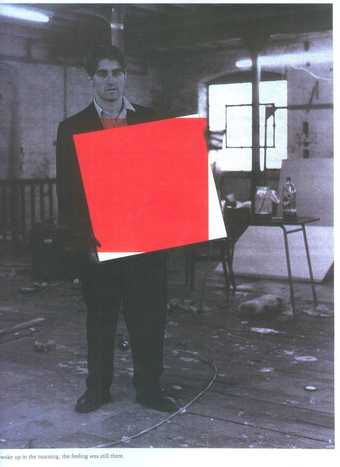
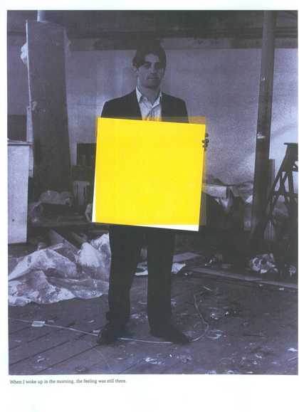
Angus Fairhurst When I woke up in the morning, the feeling was still there 1
1997 -
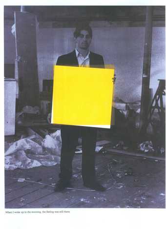
Angus Fairhurst When I woke up in the morning, the feeling was still there 3
1997 -
Albert Irvin OBE RA Empress
1982 -

John Hoyland Gadal 10.11.86
1986 -
Gillian Ayres RA CBE Phaëthon
1990 -
Gillian Ayres RA CBE Sundark Blues
1994 -

Albert Irvin OBE RA St Germain
1995 -

Albert Irvin OBE RA Flodden
1978 -
Sir Anthony Caro #15 Point
1993