- Artist
- Martin Creed born 1968
- Medium
- Neon lights
- Dimensions
- Object: 505 × 500 × 60 mm
- Collection
- ARTIST ROOMS Tate and National Galleries of Scotland
- Acquisition
- ARTIST ROOMS Presented by the artist jointly to National Galleries of Scotland and Tate and acquired with assistance of the ARTIST ROOMS Fund, supported by the Henry Moore Foundation and Tate Members 2011
- Reference
- AR01149
Summary
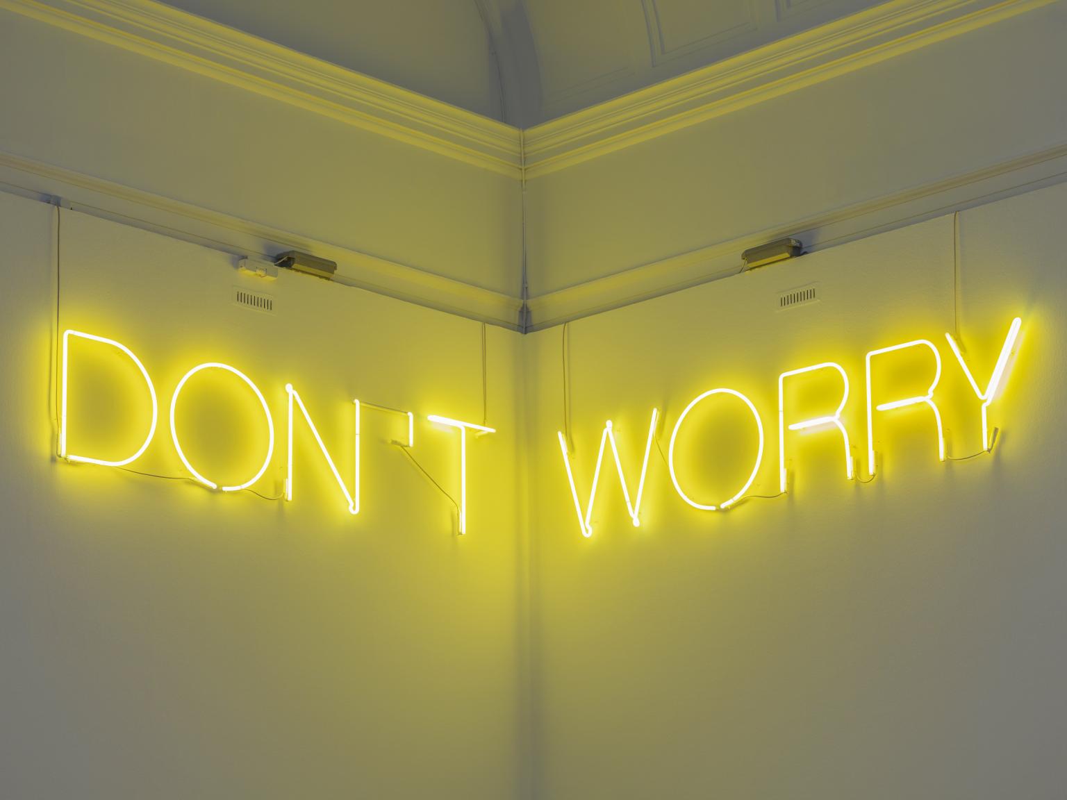
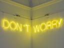
Work No.890 DON’T WORRY 2008 consists of the phrase ‘DON’T WORRY’ spelled out in yellow neon capital letters. The neon tubes are made of yellow soda glass with white phosphor powder and are 15 mm thick. They are mounted directly onto the walls using clear polycarbonate tubes. The work is always displayed in a corner so that the word ‘WORRY’ is hung on the adjacent wall to the word ‘DON’T’ but at the same height. It is displayed high enough to be out of reach so visitors invariably have to look upwards in order to view it. Each word is capped and sealed and has an electrode fixed to the end of the neon tube, with a pipe for re-gassing. Fittings, wires and tubing that appear between the letters are painted out with white emulsion. There are joins visible on the letters as each letter exceeds the length of standard neon tubes. The piece was originally manufactured by a company called Neon Circus. The life expectancy of a neon artwork is around five to ten years, regardless of whether it is on display, and so this work will have to be re-made in the future.
As is the case with many of Creed’s artworks, Work No.890 DON’T WORRY is one of a series of almost identical works, the first of which is Work No.220 (DON’T WORRY) 1999–2002, which includes the same words in white neon. Subsequent versions are as follows: Work No.239 (DON’T WORRY) 2000 (in blue neon), Work No.252 (NOLI SOLICITUS ESSE / SORGE DICH NICHT / DON’T WORRY / MH MEPIMNA) 2000 (in white neon, installed at St Peter’s Church, Cologne, Germany), Work No.273 (DON’T WORRY) 2001 (in yellow neon), Work No.277 (DON’T WORRY) 2002–3 (in green neon), Work No.291 (DON’T WORRY) 2003 (in red neon) and Work No.794 (DON’T WORRY) 2007 (in white neon).
The phrase ‘DON’T WORRY’ is ambiguous in that it is apparently reassuring yet implies that there is something to be anxious about. Critic Michael Archer has written about this ambiguity in relation to the way in which the text is spread across two walls:
This arrangement has the effect of splitting the text in half so that instead of striking one as a single platitude it appears to be two separate commands. First comes a prohibition: whatever it is you are doing, don’t do it anymore. Secondly there is an order to become anxious and concerned. The disconcertingly conflicting implications of the text are heightened by the lurid, intense yellow of the neon.
(Archer 2008, p.44.)
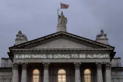
In that it conveys a direct, seemingly innocent invocation to relax or to enjoy improved mental health, the work can also be associated with other pieces such as Work No.203 EVERYTHING IS GOING TO BE ALRIGHT 1999 (Tate T12799), which consists of the titular phrase made in white neon. Creed has stated that ‘I work to feel better. I produce things to help me to live ... Living and working is a matter of coming to terms with, to face up to, what comes out of you’ (Creed, Eccles, Gioni and others 2010, p.989). However, the curators of Intelligence, an exhibition held at Tate Britain in 2000 which included Work No.220 (DON’T WORRY), noted that the sentiments that Creed expresses in his text works are rarely as simple as they appear: ‘Such words of reassurance are often used when we feel most anxious. Seen in the context of the gallery, they suggest the kind of utopian role that artists might wish for, while puncturing any such ambition.’ (Creed in Virginia Button and Charles Esche, Intelligence: New British Art, exhibition catalogue, Tate Britain, London 2000, p.50.)
Creed’s emphasis on subjective feelings and personal experience contrasts with the more cerebral text-based art of prominent conceptual artists such as Joseph Kosuth, Ed Ruscha and Lawrence Weiner (see, for example, Kosuth’s Clock (One and Five), English/Latin Version 1965, Tate T01909, and Weiner’s STRAIGHT DOWN TO BELOW 1988, Tate AR00131). Unlike these predecessors, Creed avoids using overly intellectual or philosophical language, remarking that ‘I want what I want to say to go without saying’ (Martin Creed, ‘I don’t know what I want to say’, 2001, http://www.martincreed.com/site/words/i-dont-know-what-i-want-to-say, accessed 17 June 2013).
Creed’s work is generally linked to a wide range of art movements including conceptualism, minimalism, situationism, abstraction and the Young British Artists movement of the 1990s. However, Creed often resists categorising his work according to such a lineage, remarking with an air of naivety and humour that ‘everything is kind of a little experiment in trying to make enough decisions to be able to come up with something I am happy with’ (Creed, Eccles, Gioni and others 2010, p.x).
Work No.890 DON’T WORRY was first exhibited at Ikon Gallery in Birmingham in 2008. Creed became the first new artist to join the ARTIST ROOMS collection after its formal establishment in 2008 when he donated a complete ‘room’ of his work in 2012, including this work.
Further reading
Martin Creed: Works, exhibition catalogue, Southampton City Art Gallery, Southampton 2000.
Michael Archer, ‘It’s Like This’, in Martin Creed, exhibition catalogue, Ikon Gallery, Birmingham 2008, pp.36–47.
Martin Creed, Tom Eccles, Massimiliano Gioni and others, Martin Creed Works, London 2010, reproduced p.890.
Andrew Patrizio
The University of Edinburgh
June 2013
The University of Edinburgh is a research partner of ARTIST ROOMS.
Does this text contain inaccurate information or language that you feel we should improve or change? We would like to hear from you.
Explore
- abstraction(8,615)
-
- non-representational(6,161)
-
- text(1,043)
- emotions and human qualities(5,345)
-
- anxiety(1,028)
- compassion(47)
- light(150)
You might like
-
Martin Creed Work No. 944
2008 -
Martin Creed Work No. 1102
2011 -
Martin Creed Work No. 837
2007 -
Martin Creed Work No. 1103
2011 -
Martin Creed Work No. 1104
2011 -
Martin Creed Work No. 1105
2011 -
Martin Creed Work No. 1273
2011 -
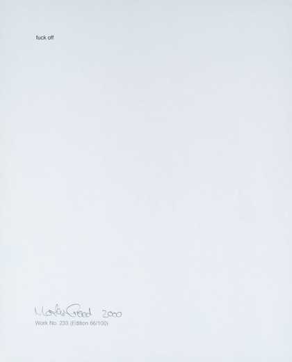
Martin Creed Work No. 233
2000 -
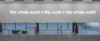
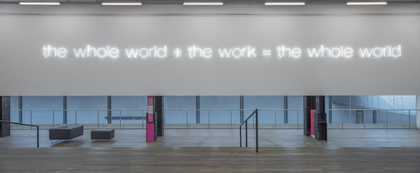
Martin Creed Work No. 232: the whole world the work = the whole world
2000 -
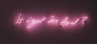
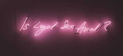
Tracey Emin Is Legal Sex Anal
1998 -
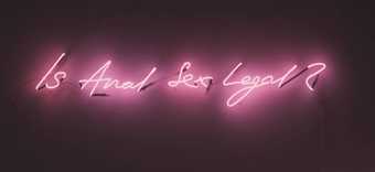
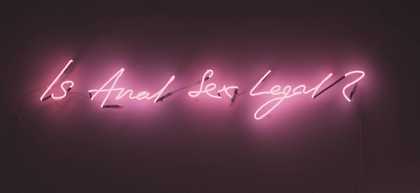
Tracey Emin Is Anal Sex Legal
1998 -

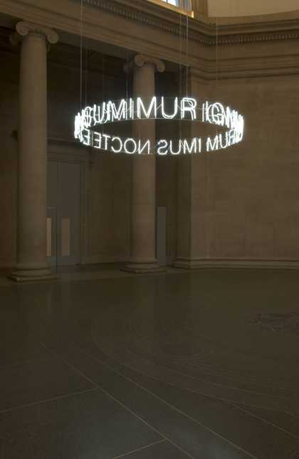
Cerith Wyn Evans In Girum Imus Nocte et Consumimur Igni
2006 -
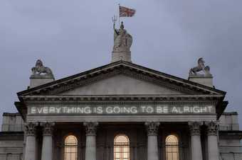
Martin Creed Work No. 203: EVERYTHING IS GOING TO BE ALRIGHT
1999 -
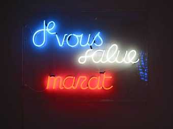
Ian Hamilton Finlay Je Vous Salue Marat
1989 -
Martin Creed Work No. 227: The lights going on and off
2000