In Tate Modern
- Artist
- Sonia Delaunay 1885–1979
- Original title
- La Prose du Transsibérien et de la Petite Jehanne de France
- Medium
- Watercolour and relief print on parchment
- Dimensions
- Support: 1956 × 356 mm
- Collection
- Tate
- Acquisition
- Purchased 1980
- Reference
- P07355
Summary
Prose on the Trans-Siberian Railway and of Little Jehanne of France was an artistic collaboration between Sonia Delaunay and the poet Blaise Cendrars comprising a twenty-two-panel illustrated poem. Each panel features a portion of text on the right and a watercolour by Delaunay on the left. The watercolours are predominantly abstract, built up of blocks or sweeps of colour, which range from cool pastel tones to bright indigo blue, vermillion, purple, yellow and green. Delaunay’s paint work also spills onto the right side, filling in the space between Cendrars’s stanzas, which were printed on a letterpress in a variation of colours, sizes and typefaces.
Prose on the Trans-Siberian Railway was produced in Paris in 1913 and published by Cendrars’s own self-financed publishing house, Éditions des Hommes Nouveaux (New Man Publishing). The text and artwork was printed on a single sheet of paper, folded accordion-style to form the twenty-two panels (McQuiad 2010, p.10). When unfolded it is two metres tall. The original print run was intended to be 150 copies, which, if laid end to end, would be the same height as the Eiffel Tower, however only sixty editions were printed. Due to its large scale, Prose on the Trans-Siberian Railway only functions as a readable book when it is fully open. It is usually exhibited unfolded and laid out in a vitrine, or shown hung as a wall piece. Art historian Juliet Bellow has discussed how this ‘extension of scale … challenges the viewer’s perceptual limits’, as they must grapple with the content in sequence, arguing further that the ‘scroll like piece’ gives ‘visual form to the extended voyage Cendrars’s text recounts … becoming aware of our spectatorial journey as it unfolds’. (Juliet Bellow, ‘On Time: Sonia Delaunay’s Sequential Simultanism’, in Montfort and Godefroy 2015, pp.98–108, p.100.)
Cendrars’s poem is written in a free verse style that follows the poet’s thoughts and impressions, formed while travelling on the Trans-Siberian railway during the Russian Revolution. The route is shown on a map printed in red at the top of the sheet, above the title. The narrative takes on an erratic rhythm, corresponding to the movement of the train as well as the jolting scenes of death, devastation and poverty witnessed from the window. These descriptions are punctuated by the repetition of the poet’s companion Jehanne asking ‘Dis Blaise, sommes nous bien loin de Montmartre?’ (‘Blaise, are we very far from Montmartre?’) The final section of the poem, however, is devoted to the beauty and vivacity of life in Paris – the art, the novels, the cafes and the city’s two great symbols of modernity, the Eiffel Tower and the Great Ferris Wheel. These two landmarks are the only figurative representations in Delaunay’s visual contribution.
Prose on the Trans-Siberian Railway stages the unification of text and image and is a key example of the ‘simultaneisme’ (simultaneous theory) developed by Delaunay with her husband, fellow artist Robert Delaunay. With this theory the artists explored the harmonious and lyrical effects produced by placing certain colours together. Here, just as Cendrars experimented with achieving a sense of motion in his writing, Delaunay explored the simulation of movement through the juxtaposition of contrasting colours and dynamic shapes in her contribution. In this way Delaunay’s artwork was not an illustration of Cendrars’s narrative, but a visual equivalent, intended to be seen in unison. She transcribed the poem in colours, as she heard it being read out:
The Simultanism of this book is in its simultaneous rather than illustrative presentation. The simultaneous contrast of colours and the text form depths and movements which are the new inspiration.
(Cendrars and Delaunay quoted in Pascal Rousseau, ‘“Voyelles”: Sonia Delaunay and the Universal Language of Colour Hearing’, in Montfort and Godefroy 2015, pp.70–88, p.73.)
Delaunay was born in Ukraine and lived in Russia and Germany before moving to Paris, meaning that she was fluent in a number of languages. Despite her linguistic ability Delaunay became interested in the utopian possibility of a pictorial language, as something borderless and transnational. As Pascal Rousseau has observed:
Sonia, who was able to switch from one language to another with the utmost ease and was conscious of the limits of language’s influence on thought, was to find in colour an authentic substitute for the expressive deficiencies of language.
(Rousseau in Montfort and Godefroy 2015, p.72.)
Prose on the Trans-Siberian Railway caused a sensation and was a great success, particularly due to the fact it was produced in a period of intense avant-garde artistic activity which saw the development of fauvism, cubism and orphism in Paris. It is also considered a significant moment in the production of artist books in the twentieth-century. Delaunay continued to experiment with pictorial language throughout her career, making paintings, textiles, clothes, books and posters.
Further reading
Blaise Cendrars, La Prose du Transsiberien et de la Petite Jehanne de France, trans. by Timothy Young, Princeton 2009.
Matilda McQuaid and Susan Brown (eds.), Colour Moves: Art and Fashion by Sonia Delaunay, exhibition catalogue, Cooper-Hewitt Design Museum, New York 2010.
Anne Montfort and Cécile Godefroy (eds.), Sonia Delaunay, exhibition catalogue, Tate Modern, London 2015.
Philomena Epps
March 2016
Supported by Christie’s.
Does this text contain inaccurate information or language that you feel we should improve or change? We would like to hear from you.
Display caption
This collaboration between Delaunay and poet Blaise Cendrars was envisaged as a ‘simultaneous book’, a unification of text and design in an attempt to express spoken words through colour. The poem is printed in varying typefaces and colours to reflect the erratic rhythm of thoughts and impressions formed on a train journey. Dynamic swirling colours provide a visual equivalent to the text rather than illustrating it. The collaborators intended that a complete edition would match the height of the Eiffel Tower if laid end-to-end.
Gallery label, February 2016
Does this text contain inaccurate information or language that you feel we should improve or change? We would like to hear from you.
Explore
- abstraction(8,615)
-
- non-representational(6,161)
-
- colour(2,481)
- geometric(3,072)
- irregular forms(2,007)
You might like
-
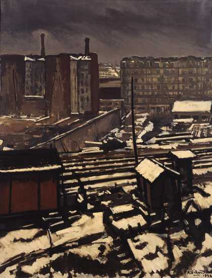
Antoine Villard Circuit Railway at Grenelle
1922 -
Amedeo Modigliani The Little Peasant
c.1918 -
Wols (Alfred Otto Wolfgang Schulze) [no title]
c.1937–50 -
Wols (Alfred Otto Wolfgang Schulze) [no title]
c.1937–50 -
Wols (Alfred Otto Wolfgang Schulze) [no title]
c.1937–50 -
Wols (Alfred Otto Wolfgang Schulze) [no title]
c.1937–50 -
Wols (Alfred Otto Wolfgang Schulze) [no title]
c.1937–50 -
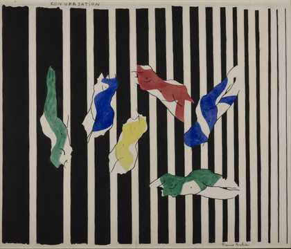
Francis Picabia Conversation I
1922 -
Lawrence Atkinson The Lake
c.1915–20 -

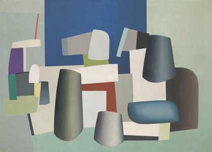
Jean Hélion Ile de France
1935 -
Natalia Goncharova Rayonist Composition
c.1912–13 -
Iwan Puni (Jean Pougny) Relief
c.1915–16 -

Jean Crotti Portrait of Edison
1920 -

Thomas Tennant Baxter A Bather
1919 -
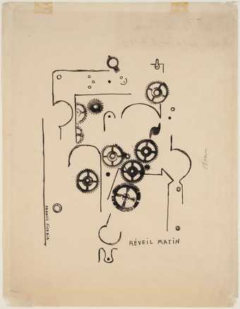
Francis Picabia Alarm Clock
1919