Not on display
- Artist
- Helen Frankenthaler 1928–2011
- Medium
- Lithograph on paper
- Dimensions
- Image: 764 × 942 mm
- Collection
- Tate
- Acquisition
- Presented by Tyler Graphics Ltd in honour of Pat Gilmour, Tate Print Department 1974-7, 2004
- Reference
- P12069
Summary
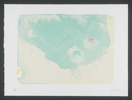
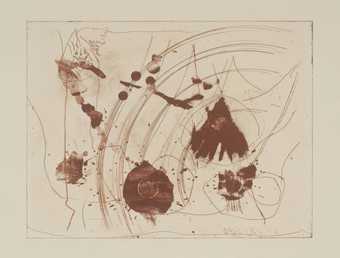
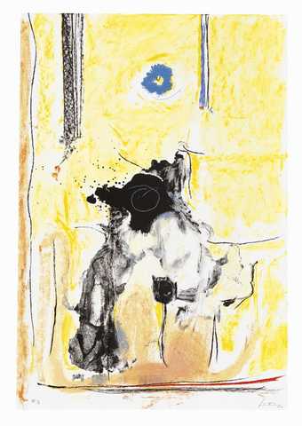
The second-generation Abstract Expressionist painter, Helen Frankenthaler has pursued printmaking since the early 1960s. She has continually tested the limits of the printed media with which she works, developing innovative means through which to express her distinctive abstract language. In her prints she aims to create ‘immediate images’, works which look as if they have ‘happened all at once’ (Frankenthaler quoted in Judith Goldman, Frankenthaler: The Woodcuts, exhibition catalogue, Naples Museum of Art, Florida, 2002, p.4).
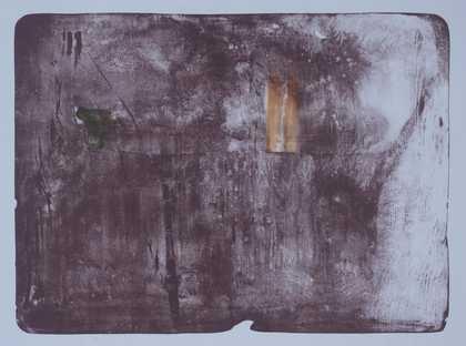
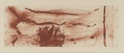
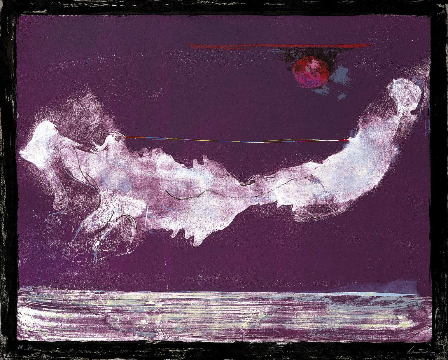
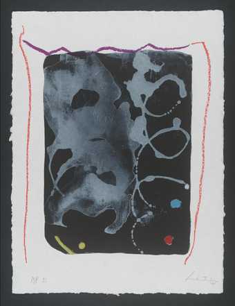
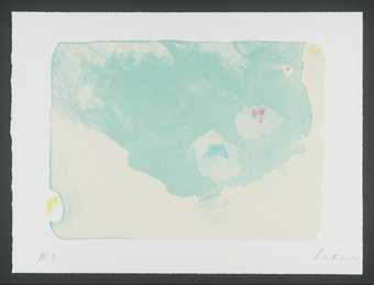
Mirabelle was produced at the studio of Tyler Graphics Ltd in an edition of 56 including 14 artist’s proofs, of which Tate’s version is number nine. This print is named for its rich purple colour – the Mirabelle being a type of plum. However, the essentially monochromatic scheme of the print belies the numerous colours which were used in its printing. One stone was used for the background hue, while nineteen aluminium plates were used to print twenty-three subsequent colours in the following order: white; blue; light blue; light green; light red; red; grey; dark red; pink; violet; black; red-black; transparent black; yellow, orange and green; blue and dark blue; transparent magenta and light purple; dark magenta and transparent brown; transparent light green.
The multiple layering of colours combined with the apparently loose handling of the printing ink seem to defy the complex processes involved in its production. The immediacy suggested by the painterly image appears at odds with the laborious and indirect processes involved in printmaking. Indeed, as one art historian has pointed out: ‘Frankenthaler’s art relies on big gestures, intuition, and the drama of the unexpected. That she ever made prints at all is remarkable. That she made a significant contribution to the graphic arts ... is even more remarkable.’ (Judith Goldman, Frankenthaler: The Woodcuts, Naples, Florida 2002, p. 4.)
Frankenthaler often creates works in which the image spills beyond the framework of the printing plate or stone. Here, she has framed the image in a band of black which encloses and contains the abstract composition. The format is distinctly horizontal, which, along with the sun-like circle of red and band of white across the lower part of the print may be suggestive of a landscape. However, while landscapes have certainly informed the artist’s work, this influence has been viewed by commentators in terms of the compositional structure of landscape rather than a depiction of a particular environment or place. Frankenthaler regularly integrates particular motifs into her work, such as the ghost-like form which floats across the centre of the sheet. Circular forms, for example, have featured in her work since the mid-1980s.
Further reading:
Ruth E. Fine, Helen Frankenthaler: Prints, Washington 1993.
Suzanne Boorsch ‘Conversations with Prints’, Frankenthaler: A Catalogue Raisonné: Prints 1961-1994, New York 1996.
Lucy Askew
August 2005
Does this text contain inaccurate information or language that you feel we should improve or change? We would like to hear from you.
Explore
- abstraction(8,615)
-
- non-representational(6,161)
- formal qualities(12,454)
-
- spontaneity(112)
- food and drink(980)
-
- fruit, plum(5)
You might like
-
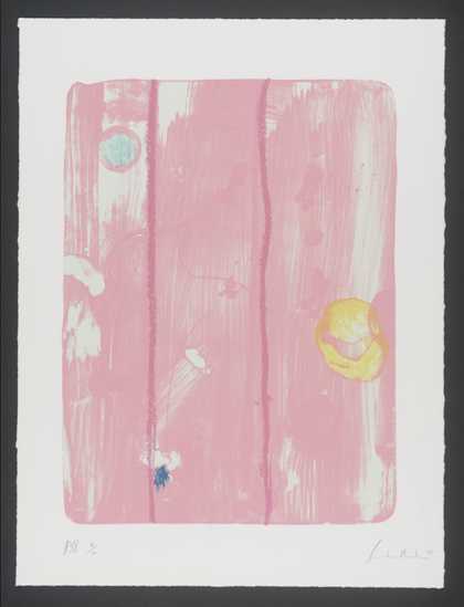
Helen Frankenthaler Door
1976–9 -
Helen Frankenthaler Magellan I
2001 -
Helen Frankenthaler Magellan II
2001 -
Helen Frankenthaler Magellan III
2001 -

Helen Frankenthaler Magellan IV
2001 -
Helen Frankenthaler Magellan VI
2001 -

Helen Frankenthaler Magellan VII
2001 -

Helen Frankenthaler Making Music
2000 -
Helen Frankenthaler Reflections VI
1995 -
Helen Frankenthaler Reflections VII
1995 -
Helen Frankenthaler Reflections VIII
1995 -
Helen Frankenthaler Reflections IX
1995 -

Helen Frankenthaler Reflections X
1995 -
Helen Frankenthaler All About Blue
1994 -
Helen Frankenthaler Madame de Pompadour
1990