In Tate Modern
- Artist
- Agnes Martin 1912–2004
- Medium
- Acrylic paint and graphite on canvas
- Dimensions
- Support: 1525 × 1525 × 40 mm
frame: 1545 × 1545 × 50 mm - Collection
- ARTIST ROOMS Tate and National Galleries of Scotland
- Acquisition
- ARTIST ROOMS Acquired jointly with the National Galleries of Scotland through The d'Offay Donation with assistance from the National Heritage Memorial Fund and the Art Fund 2008
- Reference
- AR00179
Summary
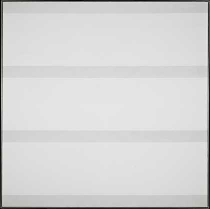
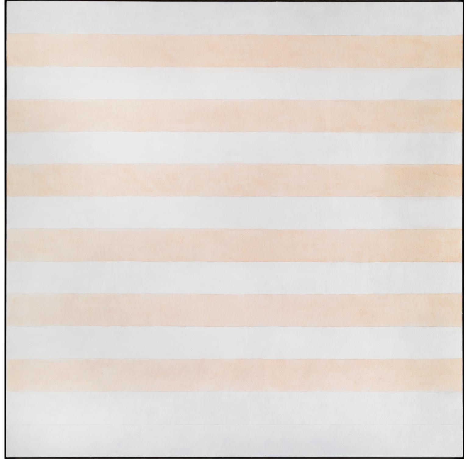
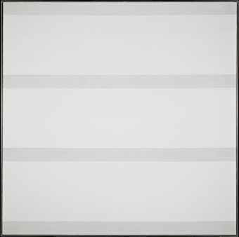
Happy Holiday is a five-foot square abstract painting on canvas by the Canadian–American artist Agnes Martin, signed and inscribed by the artist on its verso. The square pictorial field is divided into fourteen horizontal bands of equal width, alternating in colour between white and peach, with pale blue used for the top one and bottom two bands. This pattern of stripes is demarcated by wavering graphite pencil lines. As with all works from this period by Martin, Happy Holiday was begun by priming the entire surface of the canvas with an opaque coating of white acrylic gesso, which is never fully covered by subsequent layers of colour. This gives the painting an all-over visual sparseness and vibrant luminosity; the thick white gesso sealing and emphasising the slightly toothy texture of the linen canvas support. On top of this base coat of paint the artist measured out and marked with pencil and a short ruler the horizontal lines that span the width of the canvas. This shuddering, incremental approach to delineation emphasises the centrality of drawing to Martin’s painting. The type of line produced by the artist is not uniformly straight; despite her use of a ruler it exhibits an undeniably hand-drawn quality, tracing the bumps of the canvas surface. The art historian Briony Fer has noted of the artist’s practice: ‘It is striking that Martin does not draw a distinction between drawing and painting. On the contrary, she collapses it. The distinction instead is in her use of scale.’ (Fer 2006, p.176.) Certainly, the intimacy of the quavering pencil lines contrasts purposefully with the imposing size of the canvas.
Happy Holiday was completed by the duck-egg blue and pale peach colours painted into nine of the bands using a different type of acrylic, Liquitex, which gives a translucent and light-reflecting finish. The coloured paint strays beyond the demarcation of the pencil lines, giving the work a gestural and hand-made feel when viewed at close range that subverts the geometric rigidity of the composition. Of the fourteen bands, only the top one and bottom two are filled with the light blue paint, while the other bands alternate between the peachy wash and the white gesso which originally primed the canvas surface. The bands of colour don’t quite reach the edges of the canvas: the small gaps create the impression that the blue and peach washes are floating against the field of bright, solid white. As the art historian and curator Ned Rifkin has observed of these works: ‘Geometry is an abstract system of order concerned with the relation between shapes. It is also an ideal. It refers to a perfection of form that does not actually exist within the natural world. In contrast, the rectangles Martin describes within the square format of her canvases are irregular and imperfect.’ (Rifkin 2002, pp.25–6.)
Happy Holiday was first exhibited in 2000 at PaceWildenstein Gallery in New York, as part of a cycle of paintings with titles that reference states of love and happiness, including another work in ARTIST ROOMS, Faraway Love 1999 (Tate AR00178). This series reintroduced descriptive, evocative titling to the artist’s work, after the preceding group of untitled five-foot square paintings, such as Untitled #5 1994 (Tate AR00177), which had similar compositions and colour schema. Writing in 2002, Rifkin remarked of Martin’s work of the late 1990s that:
She also has begun to title her paintings for the first time since 1967, the year she stopped painting, left New York City, and moved to Cuba, New Mexico … The resumption of titles echoes the later work’s shift in sensibility and surface … In the 1960s, Martin’s titles – for example, The Cliff, The Leaves, The Rose – alluded directly to the natural world. The titles of the past few years are exuberant, even ecstatic, in tone: Beautiful Life, Tranquillity, Happiness-Glee, I Love the Whole World … the newer titles evoke Martin’s embrace of sheer goodness, pervasive well-being, and a joyous sense of the sublime.
(Rifkin 2002, p.27.)
In an interview with the art critic Irving Sandler in 1993, the artist made specific reference to this aspect of her painting, commenting: ‘I think that personal feelings, sentimentality and those sorts of emotions, are not art but that universal emotions like happiness are art. I am particularly interested in the abstract emotions that we feel when we listen to music.’ (Quoted in Serpentine Gallery 1993, p.12.) Happy Holiday’s title does allude to a temporary state of bliss, akin to experiencing a piece of music, which is inclusive and expansive in its non-specificity.
Further reading
Julia Peyton-Jones (ed.), Agnes Martin: Paintings and Drawings 1997–1991, exhibition catalogue, Serpentine Gallery, London 1993.
Ned Rifkin, Agnes Martin: The Nineties and Beyond, exhibition catalogue, The Menil Collection, Houston 2002.
Briony Fer, ‘Drawing Drawing: Agnes Martin’s Infinity’ in Carol Armstrong and Catherine de Zegher (eds.), Women Artists at the Millennium, New Haven and London 2006, pp.168–87.
Stephanie Straine
August 2010
Does this text contain inaccurate information or language that you feel we should improve or change? We would like to hear from you.
Online caption
Agnes Martin's spare, geometric compositions have drawn comparison with the work of Minimalist artists. However, Martin maintained that her paintings were concerned with the inner emotional world, searching for a perfection which was impossible to achieve, combined with the desire for contentment and serenity. The artist wrote that all her work, “is about perfection as we are aware of it in our minds but that the paintings are very far from being perfect – completely removed in fact – even as we ourselves are.” This is one of a series of paintings from the 1990s in which the artist used titles to evoke happy memories from the past.
Explore
- emotions, concepts and ideas(16,416)
-
- emotions and human qualities(5,345)
- formal qualities(12,454)
-
- purity(43)
- repetition(391)
You might like
-

Agnes Martin Untitled #5
1994 -

Agnes Martin Faraway Love
1999 -
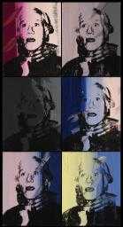
Andy Warhol Self-Portrait Strangulation
1978 -

Agnes Martin Morning
1965 -

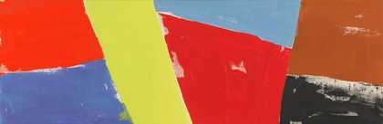
John McLean Opening
1987 -

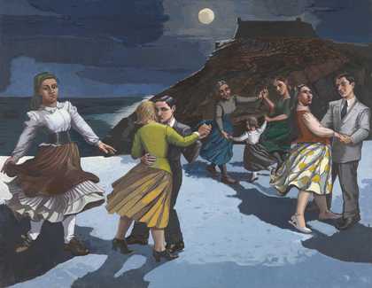
Paula Rego The Dance
1988 -
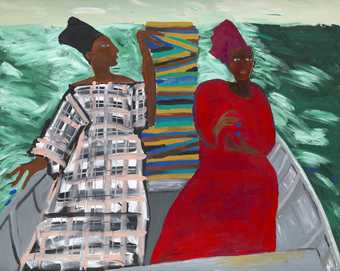
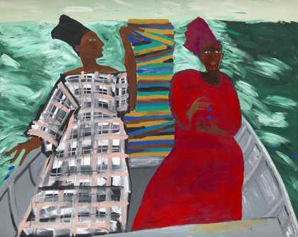
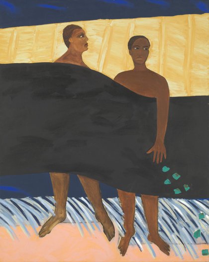
Lubaina Himid CBE RA Between the Two my Heart is Balanced
1991 -
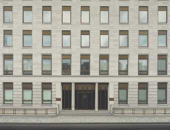
Lisa Milroy Finsbury Square
1995 -
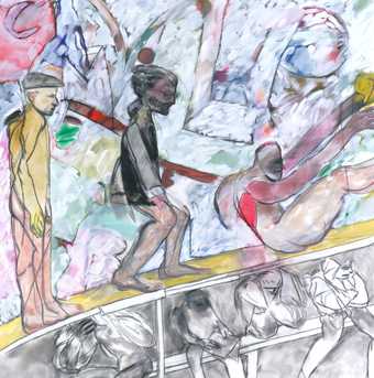
R.B. Kitaj My Cities (An Experimental Drama)
1990–3 -
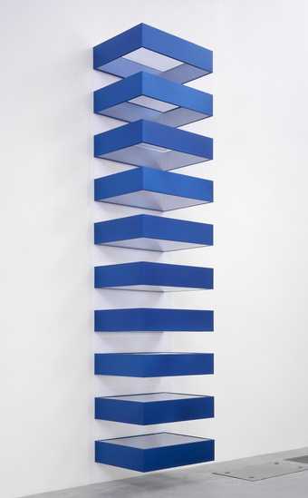
Donald Judd Untitled
1990 -
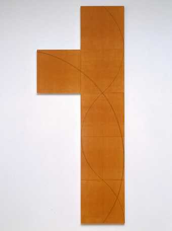
Robert Mangold Column Structure II
2006 -

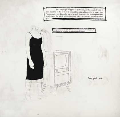
Julião Sarmento Forget Me
2005 -

Lubaina Himid CBE RA Ankledeep
1991 -
Agnes Martin Untitled #5
1991 -
Tamara Henderson Tidal Bore
2016