Not on display
- Artist
- Bridget Riley born 1931
- Medium
- Emulsion on board
- Dimensions
- Support: 1067 × 1124 mm
Perspex box frame: 1094 × 1150 × 96 mm - Collection
- Tate
- Acquisition
- Presented by the Friends of the Tate Gallery 1985
- Reference
- T04132
Summary
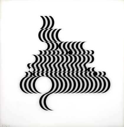
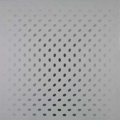
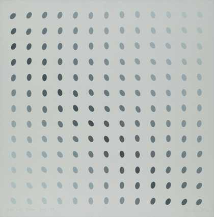
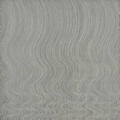
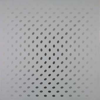
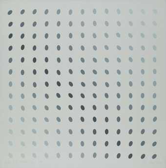
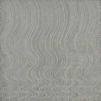
Hesitate is a painting on a rectangular board the features even rows of circular and elliptical shapes. The top row is composed of circles, giving way to subsequent rows of increasingly flat ovals, before expanding back into rows of circles in the lower half of the painting. The slimmest ovals, situated a third of the way down the work, form a compressed band three rows deep. The shapes are painted in grey tones, beginning in a pale silvery shade in the top left corner of the work. The grey darkens with each row along a diagonal axis to become almost black, before fading back to pale silver and then darkening once again in the bottom right hand corner of the painting. This combination of shifting tone and changing shapes gives the viewer the impression of motion in the painting, as if two horizontal abutting cylinders are receding into the painting, or as if a wave is oscillating across its surface.
Riley began to paint pure geometric abstract canvases in 1961. Her first works were painted in a black and white palette and were concerned with variations in shape rather than tone. This period of the artist’s op art practice is represented in Tate’s collection by Fall 1963 (Tate T00616). In 1964 Riley introduced variations in tone into her work, composing a series of paintings, including Hesitate, from a full palette of grey. Curator Paul Moorhouse observed that this imbued Riley’s works with increased subtlety:
By adopting a graduated palette of coloured greys Riley had also, in effect, denied black and white. In this respect, Riley’s infiltration of grey is a significant broadening of her visual argument, a development from the sense of absolutes advanced by earlier black and white contrasts. It is achieved through an embracing of tonal values which introduce an element of visual qualification. This is a movement, as it were, from an unqualifiable position to one that says ‘possibly’.
(Quoted in Riley 1999, p.17.)
In preparation for creating each painting in the grey series the artist made a full-size cartoon in gouache on paper, although in some cases these were not completed. The paintings were then made using emulsion applied to a hardboard panel that had been cut and assembled commercially. To prepare this panel the circles were drawn first using a compass; a template was used for the fuller ellipses, and the slimmer ones were drawn freehand. There was no mechanical process for selecting the colours, with the shades of grey being judged by eye. The orientation of this work is indicated by an arrow and the word ‘TOP’, which is drawn onto the back of the board.
Hesitate is one of six works painted in 1964 which share the same formal constraints: painted on similar sized boards, they are each composed of circles and ellipses in the palette of grey. Riley regarded each of these paintings as a whole, a ‘field’ in which the individual parts are not perceived by the viewer. Therefore the overall size of each painting is decisive when determining the placing of the compressed band, the contraction creating a visual effect which depends on an awareness of different parts of the painting at the same time. The closest companion to Hesitate is Pause 1964 (private collection) which has its compressed section in a vertical line rather than a horizontal one. For Riley this rotated axis altered the perception of the works. According to an entry on the work in a 1988 Tate catalogue, ‘She described “Pause” … with its vertical fold, as associated with the human figure, and “Hesitate” in contrast as like a landscape’. (The Tate Gallery 1984–86: Illustrated Catalogue of Acquisitions Including Supplement to Catalogue of Acquisitions 1982–84, p.257.)
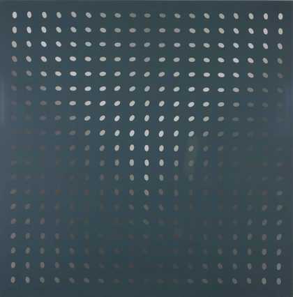
Works in Tate’s collection from this series of grey paintings include Deny II 1967 (Tate T02030) as well as Hesitate. Each of the works in the series have titles that imply emotional tension – a reflection on the increased nuance in Riley’s paintings after the introduction of tone. As the artist stated: ‘I wanted something which operated on more levels, was capable of more development, had a more “grey’d” quality, like the indeterminate nature of reality’ (Riley 1999, p.17). The recurrent tightening of the ellipses in Riley’s 1964 paintings also creates the sensation of a temporary disturbance, which is resolved by a return to the stable circle. This disruption of the regular sequence creates an unsettling experience for the viewer, one that has an emotional resonance and suggests, in Riley’s words, ‘stabilities and instabilities, certainties and uncertainties’ (Riley 1999, p.125).
Further reading
The Tate Gallery 1984–86: Illustrated Catalogue of Acquisitions Including Supplement to Catalogue of Acquisitions 1982–84, London 1988, pp.256–7, reproduced.
Bridget Riley, ‘The Experience of Painting’, in The Eye’s Mind: Collected Writings 1965–1999, ed. by Robert Kudeika, London 1999, pp.89–90.
Paul Moorhouse (ed.), Bridget Riley, exhibition catalogue, Tate Britain, London 2003.
Phoebe Roberts
March 2016
Supported by Christie’s.
Does this text contain inaccurate information or language that you feel we should improve or change? We would like to hear from you.
Display caption
Riley’s paintings of the 1960s were the best-known works of what became called op art. This referred to the optical effects that dominate the viewer’s experience of the painting. Sometimes such works have an almost physical effect, destabilising the viewer. In this case, however, the gradual changes in the shape of the grey forms seem to suggest two abutting cylinders receding into the picture frame. The fame of such works not only epitomised the way in which art reached a wider audience in the 1960s,but also influenced fashion and a wider visual culture.
Gallery label, September 2016
Does this text contain inaccurate information or language that you feel we should improve or change? We would like to hear from you.
Catalogue entry
Bridget Riley born 1931
T04132 Hesitate
1964
Emulsion on board 1067 x 1124 (43 3/8 x 45 1/2)
Inscribed ‘Riley '64' on lower left edge, and ‘ TOP | BRIDGET RILEY | 1964 | EMULSION ON BOARD | 44 1/4 x 42 inches | HESITATE' on back at centre
Presented by the Friends of the Tate Gallery 1985
Prov: Purchased from Richard Feigen Gallery, New York, by Larry Aldrich 1964; sold Sotheby's New York, 15 May 1980 (570, repr.) $11,000 bt Juda Rowan Gallery; bt private collector 1980 sold to Juda Rowan Gallery 1985; purchased by the Friends of the Tate Gallery 1985
Exh: ? Bridget Riley, Richard Feigen Gallery, New York, 1964 (no cat.); Old Hundred, Aldrich Museum of Contemporary Art, Ridgefield, USA, Nov. 1964-April 1965 (55); Selections from the Museum Collection, Aldrich Museum of Contemporary Art, Ridgefield, USA, Jan.-April 1966 (no cat.); Art of the Sixties, Aldrich Museum of Contemporary Art, Ridgefield, USA, March-June 1969 (no cat.); Exhibitions Fall 1972, Aldrich Museum of Contemporary Art, Ridgefield, USA, Sept.-Dec. 1972 (69, repr.); The Sixties Collection Revisited, Aldrich Museum of Contemporary Art, Ridgefield, USA, Sept.-Dec. 1978 (no number); Forty Years of Modern Art 1945-1988, Tate Gallery, Feb.-April 1986 (no number, repr. in col.)
Lit: Friends of the Tate Gallery, Report 1985-6, 1986, p.12 repr. Also repr. Arts Review, 38, 28 Feb. 1986 (cover)
A group of black and white paintings by Bridget Riley of 1964 have titles with an implication of some emotional tension, for example ‘Disturbance', ‘Chill', ‘Loss', ‘Where' and ‘Pause', which are distinct from her previous titles which referred to movement in a more neutral way. ‘Pause' 1964 (115.5 x 115.5, 45 1/4 x 45 1/4, private collection, repr. Bridget Riley Works 1959-78, BC, exh. cat., 1978, p.47) is similar in design to ‘Hesitate', but with the ellipses forming a vertical line and the changes of tone reversed. ‘Pause' itself develops an idea in an earlier painting ‘Movement in Squares' 1961 (Arts Council Collection, repr. Arts Council Collection, 1979, p.211) but with the rectangles replaced by ellipses and circles, and with the addition of the changes of tone.
The 1964 paintings were studied in a group of small gouaches, from which some were selected to be enlarged. For each painting the artist made a full size cartoon in gouache on paper, although in some cases these were not completed throughout. The paintings were made with emulsion on a hardboard panel that had been cut and assembled commercially, and were drawn first using a compass, and with templates for the larger ellipses (the smaller ones were drawn freehand). The shades of grey were judged by eye.
‘Where' 1964 (107 x 113, 39 1/8 x 44 1/2, private collection, New York) and ‘Loss' 1964 (117 x 117, 46 x 46, private collection, repr. Bridget Riley, exh. cat., Kunstverein, Hannover 1970, as respectively ‘Wo' and ‘Verlust' both p.51) are similar paintings using discs, but with the fold at the centre. One of the prints in the first portfolio Riley made, which were screen-printed onto plexiglass, uses a similar design (‘Fragment', 7/5, 1965. A proof is in the Tate Gallery, P07108).
The artist is concerned that the painting should be seen as a whole, as a ‘field', and the individual parts not noticed. She described ‘Pause' (conversation of 11 April 1986), with its vertical fold, as associated with the human figure, and ‘Hesitate' in contrast as like a landscape. The overall size of each painting is crucial to the placing of the fold and to the visual effect, which depends on an awareness of the contrast between different parts at the same time.
This entry has been approved by the artist.
Published in:
The Tate Gallery 1984-86: Illustrated Catalogue of Acquisitions Including Supplement to Catalogue of Acquisitions 1982-84, Tate Gallery, London 1988, pp.257-8
Explore
- abstraction(8,615)
-
- from recognisable sources(3,634)
-
- landscape(1,191)
- non-representational(6,161)
-
- geometric(3,072)
- monochromatic(722)
- formal qualities(12,454)
-
- pattern(358)
- visual illusion(118)
You might like
-
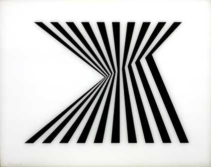
Bridget Riley Untitled [Fragment 1/7]
1965 -
Bridget Riley Untitled [Fragment 2/10]
1965 -
Bridget Riley Untitled [Fragment 3/11]
1965 -
Bridget Riley Untitled [Fragment 5/8]
1965 -
Bridget Riley Untitled [Fragment 6/9]
1965 -
Bridget Riley Untitled [Fragment 7/5]
1965 -
Bridget Riley Untitled [Nineteen Greys C]
1968 -
Bridget Riley Untitled [Nineteen Greys D]
1968 -
Bridget Riley Untitled [Nineteen Greys B]
1968 -
Bridget Riley Untitled [Nineteen Greys A]
1968 -
Bridget Riley Untitled
1964 -
Bridget Riley Blaze
1964 -
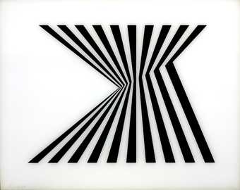
Bridget Riley Fall
1963 -
Bridget Riley Cantus Firmus
1972–3 -
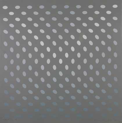
Bridget Riley Deny II
1967