In Tate Liverpool
- Artist
- Edward Ruscha born 1937
- Medium
- Lithograph on paper
- Dimensions
- Image: 685 × 914 mm
Support: 823 × 1053 mm
Frame: 1073 × 843 mm - Collection
- ARTIST ROOMS
Tate and National Galleries of Scotland. Lent by Artist Rooms Foundation 2011
On long term loan - Reference
- AL00315
Summary
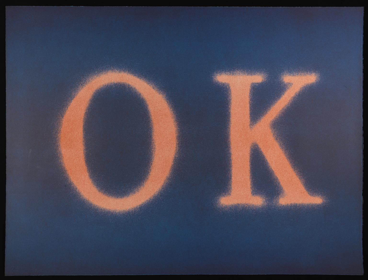
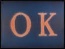
OK (Slate I) is a lithograph with the word ‘OK’ at its centre. The letters are a peach-orange colour and the background is blue. The background takes a pure shade of blue in the region immediately above and below the letters, while the section behind the letters has a purple hue. There is also purple along the top and bottom edges of the piece. The letters, meanwhile, are a darker shade of peach at their centre than at their top and bottom. Small tendrils of the text’s peach-orange colour extend beyond the edge of the text and mingle with the blue of the background. This gives the letters a fuzzy-looking effect. The lithograph was made by Ruscha in 1990, but it is a technique he has used throughout his career. Lithography allows images and text to be printed quickly and can be used to produce dozens of identical images.
The pictorial space in OK (Slate I) is abstract and non-perspectival. The blue and purple bands appear to radiate and merge with the hazy-edged text. There are no other objects in the frame against which the viewer might measure the size of the text. Ruscha has said of this kind of work, ‘The words have these abstract shapes, they live in a world of no size. You can make them any size, and what’s the real size? Nobody knows ...’ (quoted in Marshall 2010, p.106). Indeed the precise meaning of the text is also unfixed. It could allude to the abbreviated form of ‘okay’, a casual slang phrase that gestures to the stereotype of laidback Californian cool of the artist’s city of residence, Los Angeles. Alternatively, the letters might be indicative of Ruscha’s home state of Oklahoma, which can be referred to with the abbreviation ‘OK’.
Ruscha had trained as a graphic artist at Chouinard Institute of Art (now California Institute of Arts) in the late 1950s and later worked as a layout artist for a Los Angeles advertising agency. Text-based work has been central to his artistic practice and is well-represented in the ARTIST ROOMS collection, including the early painting HONK 1962 (Tate AR00184) and the later works Pay Nothing Until April 2003 (Tate AR00047) and Daily Planet 2003 (Tate AR00048). The dissolving serif letters in OK (Slate I) sit between the rough-edged, hand-painted type of HONK and the ‘no-style’ of Ruscha’s invented Boy Scout Utility Modern typeface in the paintings from 2003. Ruscha has commented that there is no grand reason behind the words he incorporates in his work, he is more interested in the sounds they make and the shapes they form. He has commented: ‘Words are pattern-like, and in their horizontality they answer my investigation into landscape. They are almost not words—they are objects that become words.’ (Quoted in Marshall 2003, p.106.)
Further reading
Alexandra Schwartz, Ed Ruscha’s Los Angeles, Cambridge, Massachusetts 2010.
Richard D. Marshall, Ed Ruscha, London 2003.
Mary Richards, Ed Ruscha, London 2008.
Thomas Flanagan
The University of Edinburgh
November 2014
The University of Edinburgh is a research partner of ARTIST ROOMS.
Does this text contain inaccurate information or language that you feel we should improve or change? We would like to hear from you.
Explore
- abstraction(8,615)
-
- non-representational(6,161)
-
- text(1,043)
- formal qualities(12,454)
-
- texture(466)
- banality(135)
- lifestyle and culture(10,247)
-
- popular culture(61)
- inscriptions(6,664)
-
- letter of alphabet(101)
- phrase(100)
You might like
-
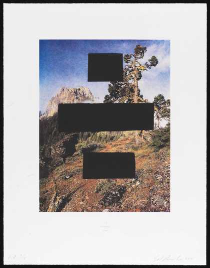
Edward Ruscha It’s Payback Time (Country Cityscapes series)
2001 -
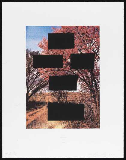
Edward Ruscha Do As Told or Suffer (Country Cityscapes series)
2001 -
Edward Ruscha Be Careful... You Hear Me? (Country Cityscapes series)
2001 -
Edward Ruscha You’re A Dead Man (Country Cityscapes series)
2001 -

Edward Ruscha You Will Eat Hot Lead (Country Cityscapes series)
2001 -
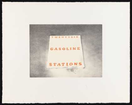
Edward Ruscha Twentysix Gasoline Stations
1970 -
Edward Ruscha Mr Ray
1975 -
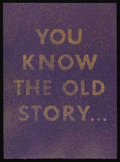
Edward Ruscha You Know the Old Story
1975 -
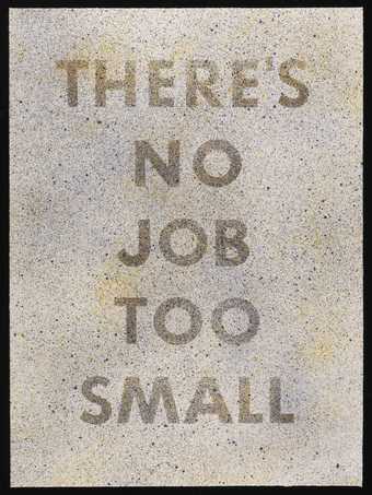
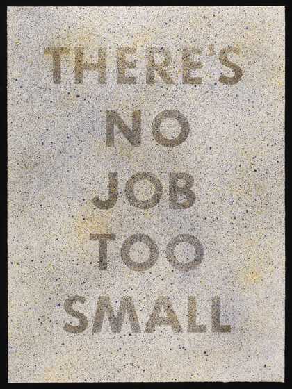
Edward Ruscha There’s No Job Too Small
1975 -
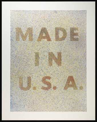
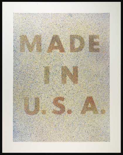
Edward Ruscha America, Her Best Product
1974 -

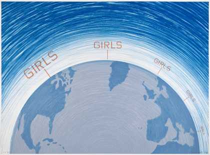
Edward Ruscha Girls
1982 -
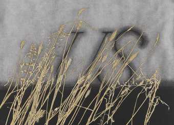
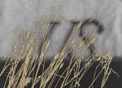
Edward Ruscha US
1995, printed and signed 1994 -

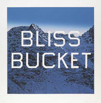
Edward Ruscha Bliss Bucket
2010 -
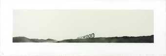
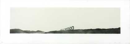
Edward Ruscha Hollywood
1969 -
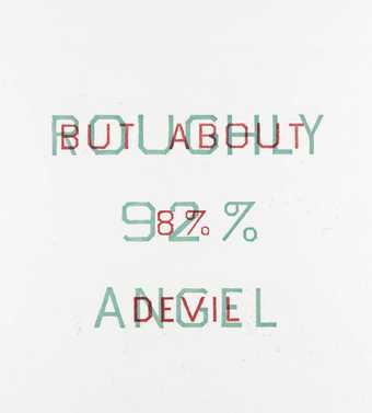
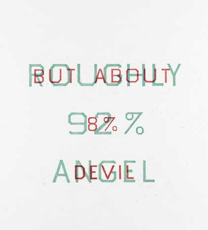
Edward Ruscha Roughly 92% Angel but about 8% Devil
1982