Not on display
- Artist
- Edward Ruscha born 1937
- Medium
- Tempera and ink on paper
- Dimensions
- Support: 279 × 457 mm
frame: 454 × 628 × 31 mm - Collection
- ARTIST ROOMS Tate and National Galleries of Scotland
- Acquisition
- ARTIST ROOMS Acquired jointly with the National Galleries of Scotland through The d'Offay Donation with assistance from the National Heritage Memorial Fund and the Art Fund 2008
- Reference
- AR00050
Summary
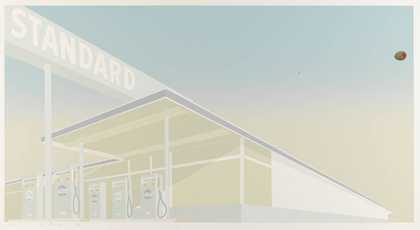
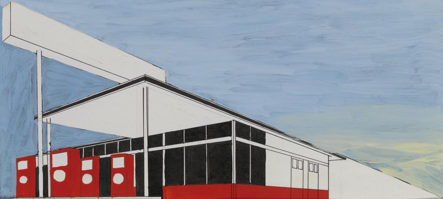
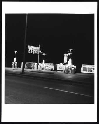
Standard Study # 3 depicts a petrol station in white, black and red ink against a pale blue tempera wash background. The station is very neatly drawn and recedes perspectivally from left to right, creating a dynamic diagonal composition. It is a simplified version of an image first explored by the artist in the monumental painting, also of 1963, titled Standard Station, Amarillo, Texas (Hood Museum of Art, Dartmouth College, Hanover, New Hampshire), which is over three metres in width. In that work, the wide stretch of canvas recalls the dimensions and proportions of CinemaScope widescreen movie projections, and in Standard Study #3 there is a similar horizontal elongation. Ruscha returned to the Standard Station image in at least three other large paintings from 1964–6, as well as numerous other works on paper.
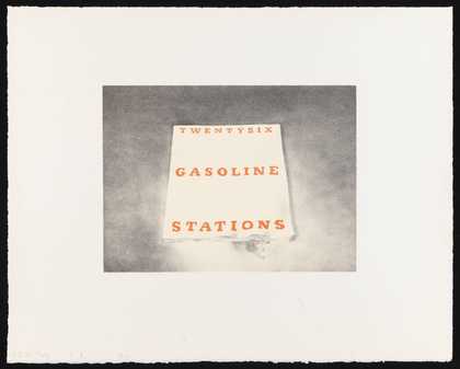
The source of this motif, which played a significant role in the development of Ruscha’s work of the 1960s and his identification with west coast pop art, can be found within the artist’s photographic publication Twentysix Gasoline Stations 1963 (Tate Library and Archive), which includes a photograph, entitled Standard Station, Amarillo, Texas, from which the gas station image was derived. In this original photograph, the diagonal positioning of the station, as it is seen from across the empty highway, is far less dynamic than in Standard Study #3, with the station’s banal architecture cluttered with bunting, roadside signs and other everyday detritus. In making a graphic version of this image, Ruscha transformed the gas station, removing any unnecessary details, exaggerating the composition and imbuing it with an iconic presence. In a conversation with the curator Sylvia Wolf, Ruscha reflected on this image and its visual and cultural associations:
The photograph was the model for other depictions, with its baseline perspective and its diagonal screaming overhead. It followed an idea I had about cinematic reality … It seemed like all movies would have a train in them. Invariably, they had the camera down on the tracks and shot this train so it appeared as though it was coming from nowhere, from a little point in the distance, to suddenly zooming in and filling your total range of vision. In a sense, that’s what the Standard gas station is doing. It’s super drama.
(Quoted in Wolf 2004, pp.264–5.)
The drawing of the station is carefully ruled and measured, apparently traced from a scaled-down template of the much larger painting. The proportions are identical across the various versions, suggesting a repeatable, reusable format used to transfer the image from one work to another. This technical method links this series to Ruscha’s work in the late 1960s as the production designer for the influential magazine Artforum, where transparencies and light boxes would have been used in the preparation of magazine layouts. The curator Cornelia Butler has suggested that Ruscha’s simultaneous practice of fine art and design definitively shaped the artist’s drawing output, writing: ‘Productively laying waste to a genre, deflating the received history of an entire category of artistic practice, is a characteristic that can be applied when considering Ruscha’s early drawings of Standard Gas stations … That is, they have all the indications of graphic design and very few signifiers of drawings, as in disegno – the overt display of the hand.’ (Rowell and Butler 2004, p.28.)
In Standard Study #3, some pencil underdrawing from the initial tracing is visible, but the majority of lines have been reinforced with black ink, which also blocks in the façade of the station and the trim of its overhang. The petrol pumps are coloured with a bright red ink, which was also used for a strip along the lower part of the building. The ink has been applied fairly quickly, so that some of the areas of block colour seep into the precisely ruled black lines and the areas of the building that have been left white as blank paper. The background is a chalky, light blue colour that clearly evokes an empty sky. There are streaks of pale canary yellow in the bottom right corner, at the point where the lines receding from the gas station’s roof meet the corner of the sheet of paper. The diagonal axis of the structure is aligned so that its upper edge begins in the top left corner and ends in the bottom right, dividing the composition into two halves: station and background, detail and emptiness. The blue and yellow tempera was brushed loosely over a darker colour underneath, possibly black ink. The presence of the yellow gives the impression of the beginnings of a smoggy sunrise or sunset, a visual motif often associated with Los Angeles and its combination of warm, sunny climate and automobile-induced pollution. The geometrically delineated station appears wholly separate from the vaguely gestural background – as if it is a two-dimensional cut-out stage set or film backdrop, referring back to the cinematic origins of the composition.
There is no sense of human presence at this gas station, where specificity is drained from the legible and highly anonymous visual image. There is also no sense of the landscape in which the station sits: the background is little more than an ironic nod to what a ‘painterly’ sky might look like, with its light washes of tempera standing in for a whole tradition of landscape painting. The station becomes a moveable, interchangeable icon, the very opposite of a functional building. The opaque black ink that cloaks the front of the building forecloses the possibility of entrance or exit: likewise, the gas pumps appear more like impassive sentinels than operational objects. Even the signs have been stripped of language – unlike the large Standard Station paintings, in Standard Study #3 the architecture remains empty of branding and signage, a void that cancels out the original photograph’s specificity. Ruscha has explained the rationale behind this decision, stating in an interview: ‘So I would look at a building and disregard the purpose of that building (in this case, a commercial outlet to sell gasoline). I was really more interested in this crazy little design that was repeated by all the gas companies to make stations with an overhang to create shade for their customers. It seemed to me a very beautiful statement.’ (Quoted in Wolf 2004, p.265.)
Further reading
Sylvia Wolf, Ed Ruscha and Photography, exhibition catalogue, Whitney Museum of American Art, New York 2004.
Margit Rowell and Cornelia Butler, Cotton Puffs, Q-tips, Smoke and Mirrors: the Drawings of Ed Ruscha, exhibition catalogue, Whitney Museum of American Art, New York 2004.
Stephanie Straine
April 2010
Does this text contain inaccurate information or language that you feel we should improve or change? We would like to hear from you.
Online caption
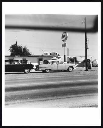
In 1963 Ruscha made a photographic book entitled ‘Twentysix Gasoline Stations’. It comprised of a selection of black and white snapshots drawn from a vast collection of images taken by the artist of petrol stations that he passed, or stopped at, as he travelled through the states of California, Arizona, Oklahoma, New Mexico and Texas. ‘Standard’ is the name of a petroleum company and this drawing is one of a number of paintings and works on paper that arose from the photographic project.
Explore
- architecture(30,960)
-
- public and municipal(2,385)
-
- petrol station(20)
- townscapes / man-made features(21,603)
-
- signage(467)
- tools and machinery(1,287)
-
- petrol pump(11)
You might like
-

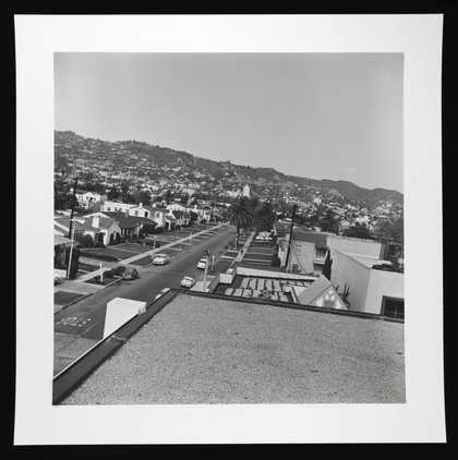
Edward Ruscha Residential (Rooftops Series #1)
1961, printed 2004 -
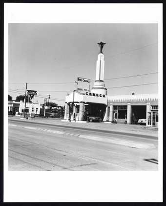
Edward Ruscha Conoco - Shamrock, Texas (from Five Views from the Panhandle Series)
1962, printed 2007 -
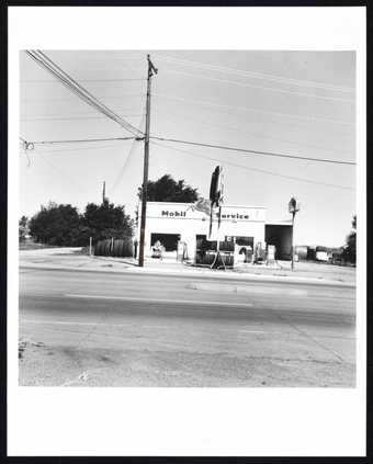
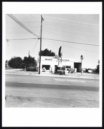
Edward Ruscha Mobil - Shamrock, Texas (from Five Views from the Panhandle Series)
1962, printed 2007 -
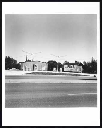
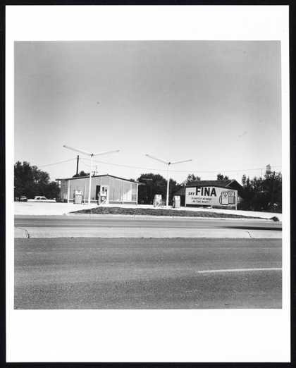
Edward Ruscha Fina - Groom, Texas (from Five Views from the Panhandle Series)
1962, printed 2007 -
Edward Ruscha Enco - Conway, Texas (from Five Views from the Panhandle Series)
1962, printed 2007 -
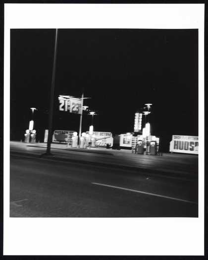
Edward Ruscha Hudson - Amarillo, Texas (from Five Views from the Panhandle Series)
1962, printed 2007 -
Edward Ruscha Sears, Roebuck & Co., Bellingham & Hamlin, North Hollywood
1967, printed 1999 -

Edward Ruscha Federal, County & Police Building Lots; Van Nuys, California
1967, printed 1999 -
Edward Ruscha Pool #5
1968, printed 1997 -
Edward Ruscha Pool #7
1968, printed 1997 -

Edward Ruscha Vacant Lot #4 (Los Angeles)
1970, printed 2003 -
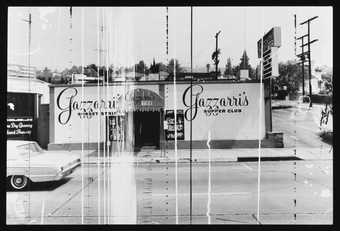
Edward Ruscha Gazzarri’s Supper Club (Sunset Strip Portfolio)
1966, printed 1995 -

Edward Ruscha Cheese Mold Standard with Olive
1969 -
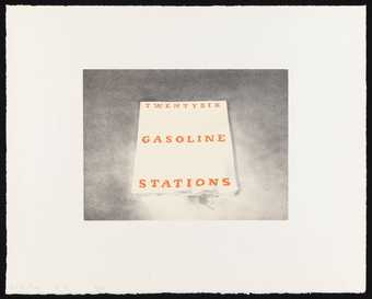
Edward Ruscha Twentysix Gasoline Stations
1970 -
Edward Ruscha Trademark #5
1962